| Bouchot navigation page, Preface, Chapter 1, Chapter 2, Chapter 3, Chapter 4, Chapter 6, Chapter 7, Chapter 8, Chapter 9, Index |
CHAPTER V.
THE BOOK IN THE EIGHTEENTH CENTURY.
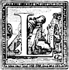
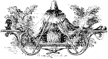
Fig. 79.—Letter by Cochin for the Mémoires d'Artillerie of Suvirey de St. Remy.
The ancient school was replaced. Constrained during three quarters of a century, French manners began to be joyous under the regency of the Duc d'Orleans. If the representatives of another age still lived, if Rigaud always painted his portraits in peruke, there were new-comers, enlivened by the new fashions, less solemn and more bewitching. Le Brun was then far in the past, and as amusing to the ladies of the regency as are now to us the fashions of the Second Empire.
The Book, after its manner, followed the movement, and gradually found the elements of its decoration in the tendencies of the day. Small sizes were multiplied, types showed elegance, and vignettes became more and more agreeable and intellectual. Amateurs had their ex-libris engraved. The smallest pamphlets were covered with ornamental letters, vignettes, and tailpieces, already very clever. Costume also, in its shorter and lighter form, gave to designers a means of agreeably composing a page of illustration and disseminating fancy in the figures. These revolutions worked themselves simply from day to day, as taste became more pronounced and exacting.
The commerce of the Book was still extending from the end of the preceding century ; and if the number of printers was limited and arrested by certain somewhat hard laws, production in Paris was enormous. Among regulations that weighed most heavily on publishers figured the obligation put upon them by the ordinance / p.186 / of 1713 to deposit eight copies of illustrated books. In 1725 the King issued other regulations to affirm the rights of the university against the corporation, forcing the masters to assist in a body at the processions of the Sorbonne and to offer on the Day of the Purification a candle to the rector. In spite of this ordinance, more religious than useful to commerce, the fashion of vignettes increased. The principal shops were searched, as they are still, for novelties ; the Rue St. Jacques and the Quai des Augustins, where they were grouped, were resorted to. The most important booksellers in 1727 were Coignard, the Barbous—who essayed afterwards, with Lengley Dufresnoy, to copy the Elzevirs,—Cavalier, Robustel, Fournier, Ballard, and D'Houry. Of the two last, D'Houry printed the calendars, and Ballard had the privilege for music. Another, Leonord, published the books of the Dauphin. At these and other publishers', recent works were examined, those who did not buy gave their advice and took ideas, and so fashion slowly formed itself. It was thus that Houdart de la Motte published with G. Dupuis in 1719 a collection of fables, with illustrations of Claude Gillot, which was the talk at the booksellers'.
In this book all was original : the author, who had had, five years before, the eccentric idea of translating the Iliad without knowing a word of Greek ; the text, a kind of imitation of La Fontaine, without salt or savour ; the size, quarto, admirably printed by Dupuis, in the Rue St. Jacques, with plates by Coypel, Massé, and, above all, the charming vignettes of Gillot, the most pleasing and clever of all his collaborators, a sort of Callot fallen into the eighteenth century, and who / CLAUDE GILLOT AND WATTEAU. p.187 / ought to take the first place by birthright. Gillot has been called, not without reason, "the last pagan of the Renaissance;" and this pagan had the honour to give us Watteau.
The Count de Caylus tells the story. Gillot had quitted the pencil for the etching needle on seeing the
work of his pupil. He had no reason to complain ; his pictures were of no value, and his prints gave other artists the idea of imitating them. The whole French school of the eighteenth century may have had its origin in this forgotten book, illustrated by the master of Watteau. In fact, in the manner of the little etching here given we may easily perceive the coquetry and / p.188 / affectation that were later the dominant tone of vignettes. For, it may well be said, the graceful, feminine, and arch manner of which we speak was, above all, conventional and false. In opposition to the designers and engravers of the fifteenth and beginning of the sixteenth century, who reproduced naturally scenes of daily life in ideal conceptions, it came, through the moral education of the artists, that they put forth the ideal in the most ordinary things of life. Shepherds were no longer the gross, rustic peasants that we find in primitive Flemish paintings or in the "Hours" of Simon Vostre ; they were coxcombs, pomaded and adorned with ribbons, playing the bagpipes, and making love to the shepherdesses of the court.
At first it was Watteau who influenced all the engravers in the pretty and the smart ; Boucher did the rest ; and fatally the Book followed, and followed impetuously, surpassing, if possible, the painted works. If the severe poses, the grave touch, of the preceding century are no longer found, they often go a little far in the contrary sense. It may be well said here that the arts are ordinarily the result of the manners of an epoch. The system of Law was not without influence on the entire eighteenth century, by the terrible manner in which he upset fortunes, awoke appetites, gave rein to aspirations hitherto held in check. Claude Gillot, the designer, was one of the first victims of the Scotch banker ; he lost his fortune on the Exchange ; but who may say what his artistic ambition dreamed of in the midst of all these disorders ? One thing is certain : that Watteau, his pupil, broke off very short with the style of the seventeenth century.
Laurent Cars was the engraver who multiplied the compositions of Boucher, and made them the fashion. He engraved also, after the painter of shepherds and nymphs, illustrations to Molière, the most agreeable that there are for style and spirit. In engraving certain works of Lemoyne, Cars did not completely desert the ancient school. He appears at the beginning of the eighteenth century as if divided between two manners each equally possible to him.
The work of these engravers was almost exclusively in etching, biting with acid a copper plate covered with varnish, on which the drawing was made by means of a point. This process, always previously used for sketches, served also for finishing vignettes, which up to then had been finished by the burin. The suppleness of the work was greater, and the artist remained more himself than he could be with the stiff cutting instrument of the seventeenth century.
The sizes of books had not yet all come to octavo or duodecimo. The works of Molière published by Prault in 1734 in six volumes quarto, under the direction of Marc Antoine Joly, give the idea of an important work, not at all of theatrical pieces. To tell the truth, these somewhat exaggerated dimensions allow artists more room for illustration ; later, when smaller forms predominated, text and engravings were so compressed that they were not always clear and readable to every eye ; but the quarto was not graceful, it was not in harmony with the finikin, the pastoral pieces, then presented, and it had to disappear as a current size in illustrated publications.
The class of artisans employed on the Book is not / p.190 / identical in the eighteenth century with that of printers and publishers. In the beginning as we have seen, the cutters of wood blocks and the printers were often the same people, preparing their characters or their blocks, and afterwards putting them under the press. Large printing offices had very quickly changed that. Each particular work had its special workman. Typography had its type-founders, compositors, forwarders, inkers, and pressmen. In the eighteenth century this was complicated by designers, engravers, plate-printers, and these different professions occupied themselves on the Book in manipulating the sheets in their turn. In the midst of this crowd, the designers and engravers, esteemed as was their collaboration, were not the most honoured. Their homes often reflected the effect of their life as clever artists, quick to spend the money earned during the week ; and we shall have occasion to name some of the more miserable among them.
The booksellers, on the contrary, had become great personages. In the preceding chapter we have seen Cramoisy and Vitré, to name only them, acquire the greatest honours, the latter painted by Philip de Champagne, with many others lords of the court. In the eighteenth century there were Brunet, Ballard, Mariette, Chardon, Didot, and a host of others, during the time of Watteau, Boucher, and Cars, of which we shall shortly speak ; and these several publishers had houses of their own, and furnished shops and printing offices with the best apparatus. Saved from falling into negligences by royal regulations on printing, they composed with admirable characters, on paper of the first order, imperishable works ; and, usual consequence of their
/ COCHIN. p.191 /
high situation, they paid the artists badly charged with their work. It would be long and tedious to enter into this matter in detail. They made progress by slow degrees, and in good time they marvellously united copper plate engraving to printed text, so marvellously, that in comparing their works to the wood blocks of
the sixteenth century, it may be asked which of the two styles is superior in elegance and good taste.
One of the ancestors of this group of vignettists was the younger Cochin, who had engraved the plate of the monks in the fables of Houdart, illustrated by Gillot. Cochin, in spite of his passion for allegory and his / p.192 / very marked taste for affectation, gave, it may be said, with the designer-engraver St. Aubin, an enormous impulse to the art of adorning books. From the beginning of his career he worked for the publishers, composing frontispieces, ornamented letters, and tailpieces, or transferring to copper the drawings of others. Singular type of artist, besides, educated, well brought up, epicurean and spendthrift, friend of great lords, and protected by Madame de Pompadour. When he travelled in Italy with her young brother Abel Poisson, Cochin did everything, was ready at the least request, inventing curious menus, giving representations of fêtes, and yet finding the time to decorate books and design vignettes profusely.
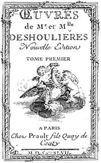
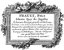
He worked chiefly for Jombert, a sort of learned bookseller, King's printer for the artillery, who dates from July, 1736. Jombert was visited by painters. He gave little private soirées, which Cochin attended, and where he daily made numerous friends. It was in this house, of so special a character, and, it may be said, so little artistic at first sight, that Cochin invented his best frontispieces, among them that of the Calcul Différentiel, that of the Astronomie Physique, and the plates of the Méthode de Dessin, after Boucher. He was one of the first to produce engraved titles, with which the publisher Prault ornamented his dainty volumes, and which were imitated, up to the end of the eighteenth century, by all the illustrators who followed. In that to the works of Madame Deshoulières the letter itself is engraved. Since then the open letter has been copied in typography. These vignettes were used many times by publishers, sometimes simply effacing the / COCHIN. p.193 / inscription, sometimes reproducing the original design by a different artist. The boy with the swan had decorated in 1744 a "Jerusalem Delivered" in Italian,
by the same publisher, Prault ; it was then engraved by Aveline. Fessard engraved the second plate, which is here reproduced.
Nearly all the frontispieces of the Book with vignettes of the eighteenth century preserve this arrangement : an ornamented and draped border, with garlands of roses, symbols, and cupids, in the middle the title, in red and black, composed in open letter, often a scroll with the address of the publisher, but rarely a mark. It was the time of little winged cupids, goddesses, and gods. The goddesses were the favourites of the kings, Madame de Pompadour or the princesses, but rarely the virtuous Marie Leczinska, too homely and too much ignored to tempt the artists ; the kings or the princes were the gods.
After Jombert, Prault, and Coustellier, Cochin worked for François Didot, syndic of the printers, for whom he prepared a set of illustrations to Molière. Unfortunately Didot died in 1757, and the project fell with him. Of the work of Cochin there only remains the set of Tartufe etchings in octavo.
In the vortex into which he was plunged, he successively illustrated the works of Rousseau, published at Brussels, quarto ; those of Boileau, published by David and Durand, octavo ; and Henault's "History of France," in the same size, with numerous vignettes. One of these should be noted in a book treating of printing ; it is that in which Cochin pretends to show to his contemporaries the interior of a workshop in 1470. Without doubt the sketch of this print was taken in one of the houses frequented by him—at Jombert's, Didot's, or David and Durand's—for that room in which compositors are working and printed sheets drying was not an invention of Cochin, and served to reproduce a printing office of the eighteenth century.
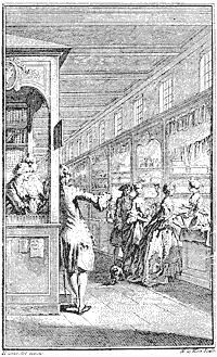
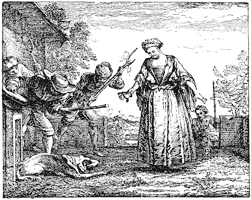
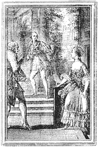
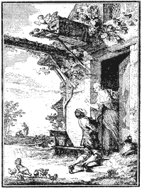
With Cochin soon worked a number of designers and aqua-fortists, too prudent to lose the opportunity. The fashion arrived for books beribboned, festooned, and flowered. Hubert François Gravelot had carried to London this style of new works, which he knew how to decorate, in his manner, better than any one, with letters, figures, and tailpieces. He did not engrave much himself, leaving this work to lesser artists, and contenting himself with subtle invention and graceful subjects. With Eisen, Cochin, and Moreau, he is the French artist in the sense of the time, free, bold, and ingenious, but perhaps a little out of place in England. He published his plates to the "Decameron" in 1757, one of the most curious of his sets of plates, and a hundred various vignettes. On his return to France he designed the Théâtre of P. Corneille, from which the Galerie de Palais is here reproduced, on account of the illustration of bookselling which it gives. In 1764 the large salon of the Palace was still, as in the time of Abraham Bosse, a place where shops were fitted up and the new books discussed. Side by side with the dressmakers and merchants of every category, the bookseller offers to his customer the recent products of Parisian presses. Certain works were sold under cover and not shown ; there is here something to pique the curiousity of unoccupied young men who strolled about and prolonged their stay in the galleries.
Eisen has a simplicity, a good taste, and a special and singularly perfect economy of artistic effect combined with typography. It appears hard that the designer had no consultative voice in the choice of impression and disposition of the Book. The union of the two forces,
 | ||
 |
|
 |
| ||
|
|
there were also a number of ingenious artists, confusing cupids and flowers, imposing blazons, delighting in playing with accumulated difficulties. Under this assuredly involuntary but real direction, publications attained proportions of luxury and coquetry until then unknown. The volume of Baisers of Dorat would not have lived but for Eisen and the delightful fancies with which he adorned it.
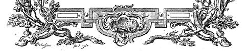
At the same time, we find Choffard, another designer and etcher of much repute, and sought after by the booksellers. Under his pencil the vignette became a chef-d'œuvre, the tailpiece was a delightful compound of judicious and sportive ornament, the taste for which grew more and more. From delicate foliage are suspended roses, shepherds' pipes, lyres, and zithers. With the zephyrs scrolls or ribbons float, carried by winged cupids. The initial letters are real pictures, of such fineness and precision that the difficulties of their reproduction prevent us from putting them before the reader.
When the fermiers généraux, those great amateur financiers of the last century, conceived the idea of an edition of the Contes of La Fontaine at their expense, their eyes naturally fell upon the artists best prepared to illustrate the inimitable fancies of the great poet, Eisen and Choffard. The first had for his task the composition of the plates, Choffard the general decoration. Ficquet was added for the portrait of the bonhomme La Fontaine—Ficquet, whose specialty in this genre was dazzling in its delicacy and spirit ; Diderot wrote a short introduction ; the composition was confided to a printer of the first order, and it was put on sale by Barbou.
It is not a book to be recommended from a moral point of view, but the typographical art, joined to that of designers and engravers, never obtained a more com-
plete success : the size in octavo, the impression clear, united with the dimensions of the plates in a harmonious elegance, well calculated to please the three rich / p.200 / personages and the joyous amateurs to whom the Contes address themselves. True, Eisen has dressed the greater part of the characters in the costume of his time, which is a little hurtful to one's feelings to-day ; it may be imagined, however, that it was La Fontaine who was mistaken, so that these delicate, risky tales appear to be created for the seigneurs of the time of Louis XV.
All the special literature sought for then by rich people had not the value of the Contes. There was at Rheims a person, who has to-day become the mode, as he was in the time of Louis XVI., who sold under cover a quantity of licentious books of the better kind, adorned with figures by Eisen, Marillier, or Cochin ; this was Cazin, an artist in his way, but whose good name suffered under a scandalous trial. An order of the Council of State in 1764 enjoined him to cease his trade in the Place Royale at Rheims, where he sold his particular merchandise. It appears that the sentence was not without appeal, for we find Cazin at Paris about 1785. He was one of those who were ruined by the Revolution, after he had popularised the editions known as Petits Formats, printed by Valade, of Paris.
We have come to the most beautiful illustrated books of the eighteenth century, and to the illustrious artists of whom we shall speak in good time should be added the younger Moreau and St. Aubin, the former nephew by marriage of the publisher Prault, and therefrom a decorator of the Book, the other thrown by Gravelot into full work, and rapidly becoming the most subtle and adroit of the etchers of the time. Moreau did not / THE YOUNGER MOREAU. p.201 / wait long after his marriage before setting to work. He began with ornaments destined for the Histoire de France of President Henault ; then he composed, in his own personal manner, titles and tailpieces for his uncle. In the Book he is the propagator of garlands of roses, which he grouped with an ideal grace ; he twined them in the borders of his frontispieces, and put them judiciously
in his tailpieces. He excelled in inventing subjects referring to the text which were not commonplace ornaments suitable for anything. The tailpiece on p. 202, taken from the works of Molière, brings forcibly to mind the Médecin malgre Lui, with its wood-cutter unmercifully beaten with sticks and muffled in a scientific robe. It is the same with other illustrations, that / p.202 / cannot be displaced from the position assigned to them by the artist without disappointment.
The year 1773, which saw the publication by De Bret of the works of Molière, may perhaps be considered as that in which the French Book of the eighteenth century reached its culminating point. M. de Laborde, first valet de chambre of the King and governor of the Louvre, published with De Lormel, printer to the Academy of Music, his celebrated collection of Chansons,
dedicated to the young Dauphiness Marie Antoinette, and partly illustrated by the younger Moreau. The work is exquisite, of powerful yet simple grace. The sentimental note of the century was struck in it, the insipid love of shepherdesses there tenderly sighed, and the designer has delightfully rendered this arch side of the pastoral song.
Our task does not permit us to linger over the works of this prodigious and charming artist, but we must mention his inimitable plates to J. J. Rousseau, the finest / FRENCH ARTISTS OF THE EIGHTEENTH CENTURY. p.203 / and most agreeable of his compositions and vignettes, also his chef-d'œuvre, the Histoire du Costume.
As evidencing the activity of French artists of the
Book in the eighteenth century, we cite the number of works illustrated by the respective artists enumerated in the last edition of M. H. Cohen's valuable Guide de l'Amateur de Livres à Gravures du XVIIIe Siècle:—
|
Aliamet, 34. Audran, 16. Aveline, 33. Baquoy, 87. Basan, 9. Binet, 48. Borel, 29. Boucher, 47. Bovinet, 34. Cars, 13. Chedel, 21. Chenu, 18. Choffard, 50. Cochin, 143. Coypel, 24. Dambrun, 77. Delaunay, N., 95. Delignon, 50. Delvaux, 66. Duclos, 49. Duflos, 56. Dunker, 15. Duplessis-Bertaux, 22. Eisen, 135. Elluin, 14. Fessard, E., 69. Ficquet, 14. Flipart, 24. Fokke, 14. Folkema, 17. Fragonard, 10. |
Freudeberg, 7. Gaucher, 55. Ghendt, 78. Godefroy, 29. Gravelot, 86. Grignion, 13. Gutenberg, 20. Halbou, 58. Helman, 22. Ingouf, 18. Langlois, 18. Le Barbier, 54. Le Bas, 39. Lebran, 21. Leclerc, 11. Legrand, 45. Lemire, 77. Lempereur, 68. Leveau, 31. Longueil, 97. Marillier, 116. Martinet, 27. Masquelier, 42. Massard, 40. Monnet, 67. Monsiau, 22. Moreau, 138. Née, 48. Pasquier, 18. Patas, 65. Pauquet, 23. Petit, 23. |
|
Picart, 62. Ponce, 65. Prévost, 40. Prud'hon, 14. Queverdo, 54. Rigaud, 18. Roger, 17. Romanet, 26. |
Rousseau, 24. St. Aubin, 70. Scotin, 27. Sève, 29. Simonet, 83. Tardieu, 64. Tilliard, 15. Trière, 39. |
Doubtless some of these ascriptions are for frontispieces only, but as a list of the principal book illustrators of the time, and as showing the measure of their popularity, this table is of much interest.
With the Revolution the decline of the Book arrives, as that of all the arts. Moreau, friend of David, had become affected by the new ideas and the burlesque renaissance of Greek and Roman art. He made his apology on the altar of the gods, and engraved portraits on wood to punish himself for having painted the elegancies of fallen tyrants. At this game, nerve, as well as suppleness, was lost ; and if he had had only the artistic knack of the Revolution, his daughter, married to Charles Vernet, could not have written of him, " That which can be most admired is, at the same time, the fecundity and flexibility of Moreau's talent, that marvellous facility of conceiving a picturesque scene and disposing it in an interesting and truthful manner in the least extended space." This was true before, but after ?
In spite of his passion for the ideas and men of the Revolution, Moreau found himself at the end of his resources. Renouard, the publisher, received him as / p.206 / he had received St. Aubin, to whom he advanced sum after sum to prevent him dying of hunger. Like most of his contemporaries, Moreau, pressed by want, "took, quitted, and retook the cuirass and the hairshirt." He had drawn for everybody : for Louis XVI., for the Republic, for Napoleon I.
The worst of it is that after his designs for Ovid, Molière, and Rousseau, dating from the reign of Louis XVI., he should have done them again in 1804, 1806, and 1808. The difference was great, even probably for his publishers, Renouard and Dupréel. It does not appear that the pontiff of the new school, David, knew of his distress ; and Moreau succumbed in 1814 to a cancerous scirrhus of the right arm, forgotten and in the greatest misery.
We have passed a little quickly to the end of the century because it is of no importance to name each of the publishers and artists, but only to sketch briefly their tastes or their manner. We have not dwelt long on the engravers so called, because of their number ; but their dexterity remains proverbial ; they handled etching with extreme suppleness, and often interpreted the drawings of illustrators in remitting them to the needle. Many of these, not to say all, made use themselves of the etching needle, St. Aubin for example, who knew how to give to the work of others his personal mark and distinction.
The Revolution passed over some among those that it ruined, and, as stated above, they followed the movement, and lost themselves in the school of David. It was Duplessis-Bertaux who, after having furnished to Cazin, the publisher, vignettes for his Recueil des
Meilleurs Contes en Vers, 1778, and many other books, after having worked for Didot, devoted himself to patriotic engraving and to the reproduction of scenes of the Revolution. When he published his Tableaux Historiques, in three volumes folio, adorned with nearly two hundred large plates, it was under the Consulate, that is to say far from the time when the work was begun. Renouvier assures us, with his exclusive disdain for the eighteenth century, that Duplessis-Bertaux was a mystifier, and that his scenes of the Revolution were a hoax, "in the kind of spirit in vogue under the Directory." The truth is that the artist, in place of being a cheerful Callot, as might be thought from his manner of engraving, so like that of the Lorraine artist, was imbued with the emphatic and exaggerated impressions of the first Republic, its sans-culottes in the poses of the Sabines and its tricoteuses apeing Penelope.
The immense artistic advance made in France in the eighteenth century in the manufacture and illustration of the Book made itself felt throughout Europe. In Germany, Chodowiecki, born at Dantzic of a family of apothecaries, developed his talent from ornamenting the boxes of his father, and from 1758 to 1794 he designed numerous plates for books and almanacs, a little heavy in engraving but singularly clever in composition. There were a few others also designing, and Kilian, Folkema, and Ridinger produced some fine engravings, but the Book did not make so much progress in Germany as in France and England.
In England a vast improvement was manifested. Fine types were cast by Baskerville and Caslon ; printing machines were perfected. The illustration of books
/ ENGLISH BOOKS OF THE 18TH CENTURY. p.209 /
by engraved plates was in the first half of the century almost entirely done by foreigners, but an English school was arising, which attained perfection in the latter half of the eighteenth and first half of the nineteenth century. Wood engraving also, which, with the exception of blocks for head and tailpieces, had become almost a lost art, was revived by Bewick, to become later one of the chief adornments of the Book.
Before 1716 English printers obtained their best founts of type from Holland, but the establishment of the Caslon foundry rendered them independent. William Caslon, the first great English type-founder, was born 1692, and died 1766. The foundry still exists, pre-eminent in the beauty of its characters. Baskerville established a foundry about 1750, and printed at Birmingham with his own types a number of extremely beautiful books. The impetus given to fine printing by these two men rapidly spread itself, and laid the foundation of the perfection which English bookmaking reached.
As mentioned above, Gravelot illustrated many English books in the early part of the century. He designed a set of plates to Shakespeare in 12mo, 1740, and another in quarto, 1744, besides numerous frontispieces and other plates in all kinds of books. Among other foreigners who engraved for English publishers were Grignion, Kip, Van der Gucht, Houbraken, and Bartolozzi. Bartolozzi, who was very prolific in the production of engraved plates, may perhaps be called the founder of that great English school of engraving which arose with the establishment of the Royal Academy in 1769 and the encouragement given / p.210 / by Alderman Boydell. Houbraken and Vertue engraved a set of fine portraits in folio for Rapin's " History of England," 1736 ; William Hogarth designed plates for Butler's " Hudibras," 1744 ; and among other curiousities of English engraving before 1750 were Sturt's edition of the Common Prayer, entirely engraved on copper plates, 1717, and an edition of Horace entirely engraved by Pine, 1733. That the taste for illustrated books soon grew to be great is evidenced by the publication of such expensive works as Boydell's edition of Shakespeare, in nine volumes folio, commenced in 1791, and adorned with a hundred plates from pictures specially commissioned by the spirited publisher ; Claude's Liber Veritatis, with three hundred engravings by Richard Earlom 1777, Sir Robert Strange's engravings of fifty historical prints about 1750, collections of views in Great Britain by Kip, Buck, and Boydell ; Holbein's "Collection of Portraits" 1792, a hundred and fifty plates to Shakespeare engraved by S. and E. Harding 1793, all of which cost great sums to produce, and greatly contributed to the elevation of public taste. Among the artists of the latter half of the century who contributed to the decoration of the Book are Thomas Stothard, whose very beautiful designs, extending into the next century, excelled those of all his contemporaries in their grace and spirit ; Robert Smirke, best known by his plates for Shakespeare, " Don Quixote," and " Gil Blas;" Burney ; and Richard Westall. It may be said generally that the English books of the eighteenth century were of a more solid character than the French, although English art, especially in the decoration of the
/ REVIVAL OF WOOD ENGRAVING. p.211 /
Book, owes much to French initiation. It is curious to read now the opinion of a contemporary French engraver on English art. Choffard, in the preface to Basan's Dictionnaire 1767, wrote, "They" (the English), "having been supported by some foreign talent, are trying to create talent among themselves ; but they have not seized the flame of genius that vivifies all art in France."
However, what had become of engraving by cutting in reverse, the figure in relief, from which printing could be done ? It had, we may think, nearly disappeared in the midst of the continued invasion of the burin and etching. It only appeared from time to time in head and tailpieces, remaining purely typographical and lost in other decorations. There were always wood engravers, not very clever, capable only of working simple lines without charm. One of them resolved / p.212 / to resuscitate the art, and made various attempts about the end of the reign of Louis XIV. and beginning of that of Louis XV. He was named John Papillon, and was born at St. Quentin in 1661. His experiments did not go beyond a book of prayers, with thirty-six figures in relief after Sébastien Leclerc. His son, John Baptist, succeeded him, and continued to engrave without ceasing subjects of ornament, letters, often tailpieces, of a good style upon the whole, and taking an excellent place in an elaborate book. Unfortunately, grace had fled ; the processes that the practitioners exhibited one after the other were lost ; and the Papillons reconstituted, we may say, a vanished art. John Baptist also published in 1766 a theoretical treatise on wood engraving, abounding in historical errors, but in which something to learn may be found if taken with discernment. He says in his preface, " Now that excellent work is done on copper, wood engraving is neglected, and the use lost of designing and cutting the shadows of the pencil on the wood block ; most of those who work in it have neither design nor taste, and only follow their own ideas ; it is not astonishing that only very mediocre pieces come from their hands, to say nothing stronger ; the profound ignorance of nearly all who meddle with it contrives more and more to destroy the beauties of this art in which many people find neither pleasure nor grace. To obviate all this, if it be possible to me, I have undertaken to give my precepts and observations to those who wish to apply themselves to my engraving."
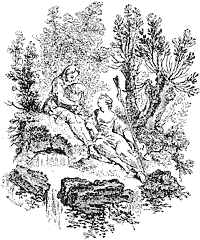
It was probably the essays of Papillon that provoked curious experiments on the part of other wood engravers. / ENGRAVING IN RELIEF. p.213 / Duplat, at the beginning of this century, proposed to prepare a relief on stone, and as this would be broken under pressure, he invented a mould ; that is to say, he took a leaden matrix from the stone cutting, and ran a resistant metal into this mould, thus obtaining a relief similar to the stone. Renouard, the publisher, made the trials ; and the younger Moreau made the designs. Moreau become an essayer of processes in 1811 ! One of the plates of La Fontaine's Fables,
published by Renouard in 1812, in two volumes, 12mo, is here reproduced.
It appears, however, that the publisher was thwarted by bad printing. The printers of Didot or Mame, much as they consecrated all their care to it, did not yet know perfect workmanship ; they put the most intense blacks into fine sheets. The great publishers trusted that better days would leave to more clever men the task of perfecting the invention.
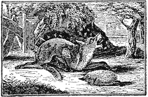
Wood engraving owes its revival and almost perfec- / p.214 / tion in England to Thomas Bewick, who published his first work in 1770, his "General History of Quad-
rupeds" 1790, and his "Birds" 1797. In these works he not only depicted his subjects with the most scrupulous fidelity, but in the tailpieces of the several chapters / FRENCH OFFICIAL PRINTING OFFICES. p.215 / he drew the most quaint, humorous, and faithful representations of country life. He, with his brother, John Bewick, and their pupils, among whom was Luke Clennell, had an influence upon English art and the decoration of the Book in England which exists to our day. Not alone with us, for he may be said to have repaid the debt which we owed to France for her illustrated books of the eighteenth century by stimulating the art of wood engraving, which was practised by Tony Johannot and the other illustrators of the nineteenth century.
To return to the eighteenth century, with which this chapter is specially occupied, we have said that the Royal Printing House, after various fortunes, still existed ; and in 1788 it worked, for better or for worse, at the Louvre. According to the budget of that year, it cost the King 90,000 livres, of which the director had 1,400.
There were, on the other hand, a certain number of official printing offices, that of war, for example, which was devoted entirely to the work of the Ministry. It was situated at Versailles, and was created in 1768. It is told of Louis XV. that, being one day in this workshop, he found a pair of spectacles, left as if in inadvertence on a printed sheet. As his sight was weakening, he took the spectacles and looked through them. The sheet was a hyperbolical eulogium composed, as if at random, by the director Bertier, in honour of the King. Louis XV., having read the dithyramb, replaced the spectacles, and quietly said, " They are too strong ; they make objects too large."
Who would believe that at the end of the century of Voltaire and Rousseau a craftsman would be found / p.216 / desirous of leading back the typographical art to its cradle, and of making xylographs again, under the name of polytypes ? A German was the original who conceived the plan. He obtained an order of council for the establishment of his presses in 1785, but the same council suppressed them 1st November, 1787. His process was to substitute for movable characters a plate of fixed letters, and probably engraved.
Another eccentricity of typography at the end of the century was the introduction of "logography" by John Walter, the proprietor and printer of the Times newspaper, which consisted in casting whole the words in most common use, in place of separate letters. The system had soon to be abandoned, but the early numbers of the Times, which was started January 1st, 1785, were printed on it.
In the eighteenth century there was a printing establishment for each of the constituted bodies ; the King, the Queen, the princes, each had their own. The royal lottery occupied a special printing house.
The young inmates of the blind asylum worked under the direction of M. Clousier, royal printer. Louis XVI. authorised the celebrated Haüy, their master, to allow them to print ; and in 1786 they composed an essay on the education of the blind. Pierre François Didot was in 1785 printer to the Prince, afterwards Louis XVIII. ; and he published the Aventures de Télémaque, in two quarto volumes, from this special printing office.
The English colonies in North America early established printing there, their first book, the "Book of Psalms," known as the Bay Psalm Book, being dated / PRINTING IN AMERICA. p.217 / 1640. By the middle of the eighteenth century literature held a strong position in the colonies, the greater part of it being, as might be expected, English ; but the revolution and subsequent establishment of the United States created a national American literature, which has flourished to this day. Among the printers of North America in the eighteenth century, the most famous was the celebrated philosopher Dr. Benjamin Franklin, who served his apprenticeship to the printing press in London. He returned to America in 1726, and worked as a printer with his brother at Philadelphia.