p.i ]

SOME  PRESS  NOTICES  ON  THIS  WORK:
First Edition
   Saturday Review.—"Any gentleman about to publish may create, in his mind's eye, without great difficulty, the appearance of the masterpiece he intends. There can be no more trustworthy guide 'For those that think in type and ink' than this clearly written and admirably printed handbook."

   New Review.—"A modest volume, but one which is pretty in its vermilion lettering upon clear white buckram . . . all professional writers ought to possess."

   Daily Telegraph.—"Abundant information is stored within its pages; in short, no one whose bent is literary will take up the book without learning some fact in typography which will both interest and enlighten him."

   Literary World.—"With the aid of this guide, one intending to publish can go to his publisher not wholly ignorant of the technicalities of bookmaking, and others can pick up a good deal of interesting information."

   Publishers' Circular.—"Writers will save themselves much trouble and unnecessary labour if they diligently master its contents, and the knowledge so gained will in turn benefit the printers."

   The Bookman.—"This is a practical handbook for authors, publishers and printers, on types, proofs, stereotyping, binding, copyright, registration, and other matters relating to the issuing of books."

   The Speaker.—"It is the outcome of wide and practical experience in the making of all sorts and sizes of choice and artistic books."

   Birmingham Daily Post.—"Booklovers as well as bookmakers are certain to be interested in a work, modestly entitled 'Some Notes on Books and Printing, a Guide for Authors and Others,' by Mr. Charles T. Jacobi, the Examiner in Typography to the City and Guilds of London Institute, which is being issued from the Chiswick Press, of which Mr. Jacobi is manager."

   
Second Edition
   Athenæum.—"Will be of real use to authors who take an interest in the form in which their books appear, and also offers to novices some excellent advice as to how to prepare their manuscript and correct proofs."

   Week's Survey.—"Needs no commendation to experienced editors and authors. An admirable specimen of the exquisite care with which artistic bookprinting is done at the celebrated Chiswick Press."

   Spectator.—"It is a really practical guide for those who write and those who publish."

   Studio.—"No better work than this could be placed in the hands of any one who contemplates writing, printing, or publishing a book."

   Library Association Record.—"It is a volume that no librarian should be without, as it would enable him to master many technical details in the production of books and catalogues."

   Publishers' Circular.—"This may reasonably be called the 'Book of Books,' seeing that without the knowledge which it comprehends no book could be properly produced."

   Daily News.—"It is a publication that no beginner in the pursuit of journalism or literature should be without, as it would enable him to master many technical details in the production of books.

   Daily Graphic.—"The whole subject of printing and the preparation of books, beginning with the manuscript, and passing by way of the index, the type, the margin, the paper, the size of the paper, the binding, right on, indeed, until the idea has taken a concrete form and the work of publishing begins, is treated of at length by one who has little to learn on the subject."

   Literary World.—"We have said that Mr. Jacobi is practical, and indeed he is well qualified to deal with his subject from a practical standpoint, having been for some years, and still being, the managing partner of the Chiswick Press."


London: The Chiswick Press, 20 & 21, Tooks Court, E.C.


p.ii ]

By  the  same  Author.
PRINTING. A Practical Treatise on the Art of Typo-
graphy as applied more particularly to the Printing of Books. With upwards of 150 Illustrations, and a Glossarial Index of Technical Terms and Phrases. SECOND EDITION. Small Post 8vo, cloth, price 5s. THE PRINTERS' HANDBOOK of Trade Recipes, Hints, and Suggestions relating to Letterpress and Lithographic Printing, Bookbinding, Stationery, Engraving, etc. With many useful Tables and an Index. SECOND EDITION, Enlarged and Classified. Crown 8vo, cloth, price 5s. THE PRINTERS' VOCABULARY. A Collection of some 2,500 Technical Terms, Phrases, Abbreviations, and other Expressions, mostly relating to Letterpress Printing. Useful book for Authors and Publishers. Crown 8vo, cloth, price 3s. 6d. ON THE MAKING AND ISSUING OF BOOKS. Fcap. 8vo, price 2s. 6d. [Out of print. THE PRINTING OF MODERN BOOKS. A Paper read before the Bibliographical Society. Pott 8vo, sewed. [Reprinted for presentation. SOME NOTES ON BOOKS AND PRINTING. A Guide for Authors, Publishers, and Others. This work is an amplification of "On the Making and Issuing of Books." Demy 8vo, blue vellum cloth boards, lettered in white. NEW AND ENLARGED (THIRD) EDITION. Price 6s. net. GESTA TYPOGRAPHICA; or, A Medley for Printers and Others. Fcap. 8vo, rubricated throughout, price 3s. 6d. net A FEW SUGGESTIONS OF PLAIN LETTERINGS FOR ARTISTS AND OTHERS. Some type models of capital letters adapted for designers, etc. Imperial 16mo, sewed, price 6d. net. N.B.—These volumes, where in print, are supplied post free on receipt of postal order by the Author at the Chiswick Press, 20, Tooks Court, Chancery Lane, London, E.C.


p.iii ]


SOME  NOTES  ON
BOOKS  AND
PRINTING

leaf design


p.iv ]


book plate design in name of 'Charles Whittingham', the red has been manually copied


p.v ]

SOME NOTES ON
BOOKS AND
PRINTING

A GUIDE FOR AUTHORS

PUBLISHERS & OTHERS

BY CHARLES T. JACOBI

MANAGING PARTNER OF THE

CHISWICK PRESS


leaf design, the red has been manually copied


LONDON:  CHARLES WHITTINGHAM & CO.
AT THE CHISWICK PRESS, TOOKS COURT
CHANCERY LANE. MDCCCCIII

p.vi ]


First printed, Nov. 1892, 1000 copies.
Reprinted, March, 1902, 500 copies.
Reprinted, June, 1903, 500 copies.


p.vii ]


NOTE TO THIRD EDITION

T
HIS new impression, save for a few minor corrections in the text, a fresh title-page, and a different colour in binding, is practically a reprint of the second edition, which was on a new and enlarged scale.
      I have nothing more to add except to thank all those friends—not forgetting the Press—who so kindly received the last edition.

CHAS. T. JACOBI.   
      June, 1903.

p.ix /


PREFACE TO FIRST EDITION
T
HE present volume is practically a revised reprint of my little book "On the Making and Issuing of Books," which Mr. Elkin Mathews published for me in the spring of last year. The appreciation with which that volume met, and the inquiries I have had for it since the limited edition was exhausted, have encouraged me to re-issue it in a different form, with the addition of many typographical specimens, and a few samples of really good papers suitable for printing purposes.
      All the types shown here are in use at the Chiswick Press, but founts which are peculiar to that office have not been included, in order that the utility of the book for general reference may not be in any way limited.
CHAS. T. JACOBI
      October, 1892.


PREFACE TO SECOND EDITION
I
N issuing a fresh edition of this work, I have introduced some additional features in the type specimens given at the end of the volume.
      The literary part has been revised and much enlarged, and I trust it will be found even more useful than the earlier issue of this work.
      I am greatly indebted to Mr. F. Howard Collins for the chapter on the Index, and for many kind p.x / suggestions and much help in the literary portion of the work. I also thought, as illustrated books are so much in demand nowadays, that the article bearing on Methods of Illustration was worthy of a fuller treatment than that accorded to it ten years ago, when process engraving was not so developed as at the present time. I therefore persuaded Mr. Walter Boutall, Chairman of Messrs. Vaus and Crampton, Ltd., who has had a long and varied experience of mechanical processes, to enlarge the chapter previously devoted to this subject, and for this I tender him my best thanks.
      I am also obliged to Mr. C. R. Rivington, the clerk of the Worshipful Company of Stationers, for looking over the proof of the chapter relating to copyright.
CHAS. T. JACOBI
      March, 1902.


p.xi /


CONTENTS
CHAPTERPAGE
I.   
II.   
III.   
IV.   
V.   
VI.   
VII.   
VIII.   
IX.   
THE MANUSCRIPT . . . . .
T
HE INDEX . . . . . . .
T
YPES AND MARGINS . . . . .
M
ETHODS OF ILLUSTRATION . .
P
APERS . . . . . . . . .
T
HE SIZES OF BOOKS . . . . .
B
INDING . . . . . . . . .
P
UBLISHING . . . . . . . .
C
OPYRIGHT . . . . . . . .
I
18
22
33
50
55
59
62
70
A SHORT GLOSSARY . . . . . . .
S
PECIMENS OF MANY TYPES . . . . . .
S
AMPLES OF VARIOUS PAPERS . . . . .
G
ENERAL INDEX . . . . . . . . .
75
89
138
160

p.1 ]

Design, printed size 8.9cm wide x 2.2cm deep


SOME  NOTES  ON

BOOKS   AND   PRINTING

CHAPTER  I

THE  MANUSCRIPT


T
HE proper preparation of the manuscript is one of the first and most important steps in the making of a book. A clearly written MS., especially if by an unknown author, will often appeal to a publisher, when he would pass over the same matter in a scarcely legible form.
      In writing, it is preferable to use a medium size of paper, such as quarto—copy-book size—for two important reasons. If additions or alterations of any extent have to be made to any one page, there is less matter to re-copy than if the paper be folio or foolscap. The latter is too high at the top or commencement of each page for writing to be done without effort or strain: a consideration not to be despised when many thousand words have to be p.2 / penned. A smaller paper makes an objectionable thickness of MS. when a book is finished.
      The paper used may be without lines, but it is better for regularity, and for estimating the number of words, if ruled paper be used, and the writing be on the lines. Each leaf should be separate, and not in folded sections, to facilitate turning over.
      One other suggestion is as follows: If the author wishes to make for his own convenience a rough draft of his manuscript, he should adopt a paper with lines rather widely ruled, or, if he has closely ruled paper, should write on alternate lines. This allows of space for interpolations and emendations.
      The writing must of course be on one side only, for it is necessary in bookwork that each compositor's portion or "take" should finish at the end of a paragraph, and if the paper be written on both sides the scissors cannot be used by the overseer who allots the portions to each compositor.
      A blank margin of one inch from the left-hand edge should always be left: it allows room for small alterations, and also for remarks and instructions to the printer.
      Each leaf must be distinctly paged in consecutive order from the first to the last, for on the MS. arriving in the printer's room it is all distributed in sections here and there, and unless this has been done, great and unnecessary trouble is caused to everyone concerned.

p.3 /

      It is, however, advisable that all manuscript should be typewritten. In many instances publishers now make it a sine quâ non: they will not even "consider" any work until it is in this form.
      Most frequently the MS. is simply sent to a typewriter to be copied; but now that a really good machine can be purchased for about ten pounds, it is very much better in every way for the author himself to learn it, and thus do away with the pen entirely for all work intended for the printer. A friend of the author's has used a typewriter for some years, and he asserts that it is no exaggeration to say that, with ordinary attention, at the end of the first month, after writing each day for an hour or more, the speed will more than equal that possible with the pen; and that with further practice this speed will be increased. The result is so good that it can always be treated as a first proof—to the great saving of the author's pocket. Another great advantage with typewriting is, that by placing a piece of thin paper and the ordinary black carbon paper over the one to be typewritten, a duplicate can be obtained as good as the one which will be sent to the printers. By this means any anxiety about the MS. being lost in transmission, or by fire—as occurred in the historic case of Carlyle's "French Revolution"—is removed, and the expense saved of postal registration and the insurance which is advisable with valuable matter. And to the young author all his p.4 / writing is valuable before it has been submitted to a publisher!
      It may be mentioned here that though the MS. be typewritten it is paid for at the "manuscript" rate. In London there are three distinct rates paid for type-setting: (a) where the copy is in print, and an absolute facsimile is to be made; (b) where the copy is in print, but is to be set up in a different type, measure, or width; (c) where the copy is wholly or partly written or typewritten.
      Avoid all interlineations: if necessary, cut the sheet in two where the addition is required, and gum in the slip containing the added matter.
      On reading the copy over, should it be desired to commence a new paragraph, a bracket mark thus [ should be put in front of the first word, and "new par." written in the margin against it.
      Should, on the contrary, a paragraph already written as such appear unnecessary, a line should be drawn from the end of the last word of the first paragraph to the first word of the next, and a marginal note made, "run on."
      Either of these alterations concerning paragraphs should only be made in the MS., as they are expensive when in type, for they often entail the alteration of a large amount of subsequent matter.
      The following abbreviations, agreed to at the International Shorthand Congress, 1887, are a great convenience, and save writing many thousand useless letters in ordinary copy. The best way to learn them — and they are worth learning — p.5 / is to write out several times both the shortened form and the word for which it stands.

LONGHAND ABBREVIATIONS RECOGNIZED BY
PRINTERS.
About, ab t.
Account, acc t.
Afternoon, aft n.
Again, ag n.
Against, ag st.
Among, am g.
Amount, am t.

Because, bec.
Been, b n.
Between, btwn.
Brought, bro t.

Caught, c t.
Chairman, ch n.
Circumstance, cir ce.
Committee, com e.
Could, c d.

Difference, dif ce.
Different, dif t.
Difficult, dif clt.
Difficulty, dif clty.

Evening, ev g.
Every, ev y.
Extraordinary, xtr y.

For, f.
From, f m.
Further, fu r.
       General, gen l.
Government, gov t.
Great, g t.

Had, h d.
Have, h.
However, how r.

Importance, imp ce.
Important, imp t.

Large, lge.

Meeting, mt g.
Might, m t.
Morning, m g.

Notwithstanding, notw g.

Objection, obj n.
O'clock, o'c.
Of, o.
Opinion, op n.
Opportunity, opp y.
Other, o r.
Ought, o t.

Particular, part r.

Question, q n.
Said, s d.

p.6 /

Several, sev l.
Shall, sh.
Should, sh d.

That, t.
The, /.
Their, there, th r.
Though, tho.
Through, thro.
Together, tog r.

Very, v y.

Whenever, when r.
Wherever, where r.
Whether, wh r.
Which, w h.
Whichever, which r.
With, w.
Without, w t.
       Would, w d.

Yesterday, yest y.
You, y.
Your, y r.

Terminations.
Ance, ence, ce.
Ever, r.
Ing, g.
Ion, sion, tion, n.
Ment, m t.

Sunday, Sun.
Monday, Mon.
Tuesday, Tues.
Wednesday, Wed.
Thursday, Thurs.
Friday, Fri.
Saturday, Sat.

      Most printing establishments of any note have their "customs of the house" as regards orthography, the use of capital letters, punctuation, etc., though they may be unwritten laws. As a rule these details can be left to the printer. If any particular style is required, a general direction should be given to the printer when handing in the copy, any little deviation being remedied in the proofs. It is the fashion now to reduce the number of capitals as far as possible, except for proper names.
      Some correspondence has recently taken place in the literary press concerning these customs and p.7 / styles, which differ in the leading printing offices, and it is to be hoped that greater uniformity will be the result.
      The beginnings of paragraphs should always be boldly indicated by insetting the first word, say an inch further towards the right than the other lines.
      The following underlinings are universally employed in MS. to indicate italic, small capitals, and capitals:

Examples of proofing instructions to obtain italics and capitals, printed size 7.9cm wide x 3.2cm deep

      Titles of works or periodicals are underlined or placed within inverted commas, to make them distinct; the printer using his discretion, except in the case of special instructions from the author.
      Extract matter included in the text—which is generally set in a smaller type—should be clearly shown, either by marking it down the side from beginning to end with a vertical line (in coloured ink or pencil is the best plan), or by setting the whole well towards the right of the other matter.
      Footnotes should each have a corresponding reference, and where possible should be written immediately after the word to which they refer. Figures, 1 2 3 4, are to be preferred for this purpose.

p.8 /

      It is most important to remember that pages are not the same as leaves: a leaf, being printed on both sides, is equal to two pages. The one side, corresponding to the right-hand page of this book, being technically called the "recto"; and the other side, the left-hand page, back, or obverse, the "verso."
      With regard to the corrections in the proofs it must be remembered that the more carefully a book is written, the less expense will be incurred for "author's corrections." This charge is often a great source of contention between the author, publisher, and printer, and is altogether unsatisfactory. A printer is bound, with certain reservations, to follow the copy supplied, and if he does that, and the author makes no alterations, there are no author's corrections and nothing to dispute. But should there be many alterations, they may prove disastrously troublesome and expensive, besides delaying the work.
      The charges made for corrections are based on the time consumed in making them, and are very difficult to check, even by an expert.
      A page of type may contain two, three or more thousands of letters, every word being built up letter by letter and line by line, till the page is complete. A small correction, trivial as it may seem to the inexperienced, may possibly involve much trouble to the printer, and the labour expended on it not being apparent, is only appreciated by a practical man. A word inserted or deleted may cause a p.9 / page to be altered throughout line by line, and a few words may possibly affect several pages.
      Therefore, if possible, in making verbal corrections always substitute words of an equal length to those removed — this is money saved in corrections.
      "Extras" comprise the foregoing author's corrections, because the labour likely to be involved is not apparent when a volume is put in hand; extraneous or miscellaneous matter, such as tables, foreign languages, etc., being expensive in composition; and all charges for types smaller than the body of the work. In the case of printed copy, termed "reprint," the extras can be accurately estimated.
      If it is necessary to correct a work in type, and the alterations are likely to disarrange lines and possibly pages, proofs in "galley" or "slip" form should be ordered. In America first proofs are generally in this form, and it will save an inexperienced author much expense if he always has them so. This means a little more trouble to the printer, but to the author or publisher less expense in the long run, because corrections can be more easily effected in slips.
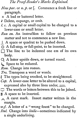
      In marking corrections for the printer certain recognized signs and symbols are used which express concisely what is required. We give on page 11 the principal characters used, and the corrections as marked by a skilled person; on page 10 is shown the type corrected accordingly. p.10 / These corrections are explained in detail on the verso of the marked page.
      In correcting a proof always ink the wrong letter or word through, and insert the alteration in the margin, not in the middle of the printed matter, because it is apt to be overlooked without a marginal reference. To keep the different corrections distinct, finish each one off with a stroke thus / and to make the alterations more clear, if they are many, mark those on the left-hand portion of the page in the left margin, and those on the right-hand in the right margin.
      We have already said that as corrections and alterations are occasionally a source of dispute between publisher, author, and printer, it is most important that these corrections should be clearly and concisely made. Frequently proofs are unnecessarily cut about, which makes it difficult for the compositor to follow, and hence he consumes more time in making these alterations. This waste of time applies also to the reader, whose duty it is to see that the author's corrections have been properly effected.
      It is also recommended that all old proofs bearing author's corrections or alterations be retained. They are sometimes necessary for the verification of charges, or in checking some presumed "error of the press," which has been discovered at a later stage.
      On receiving a proof the first thing to be done is to read it through carefully, not noticing the sense,

p.11 /

Page proof with correction marks

p.12 /

Proof-Reader's marks explained

p.13 /

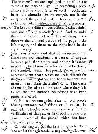
but searching for "letterals," or, in other words, seeing that every single word is spelt correctly. If sense and meaning be examined in the first place, the eyes get so accustomed to the words and their spelling that mistakes—even flagrant ones—are sometimes overlooked. Whatever else be wrong a book must be spelt correctly!
      Among many other desirable things it is important that an author should always verify in the proofs all extracts, references to dates, titles, and so forth.
      When the first proof has been read and marked by the author, and he wishes to see it again, he should write "Revise" on the top left-hand corner, and return it to the printer, who will submit a "revise" to him with the corrections carried out. Should the corrections be few and the author not wish to see it again, he writes "Press" on the sheet, which means that no more alterations will be made by him, and that after the corrections have been effected by the compositor it can at once be printed. The final, or "press proof," is always retained by the printer for future reference in case of any dispute, and the author or editor should always preserve the intermediate proofs bearing corrections, in case of queries afterwards arising.
      Printer's readers, styled "correctors of the press," are, as a rule, a very careful and painstaking body of men. Generally with practical experience, and sometimes a classical knowledge, they virtually sub-edit the MS. The queries they p.14 / mark on proofs should always be carefully considered, as they frequently indicate an interpretation of the copy that may not have occurred to the author. Searching for an interpretation of his query may often show that the passage may be understood in two ways—one of which the author may not have thought about. Hence their queries well repay consideration.
      What amount of printed matter will the MS. make—how many pages will it cover, in fact? This is not always an easy question to answer. No exact rules can be laid down; manuscript copy varying so much in character of writing, and in the quantity of deletions and insertions. A practical man has frequently to spend much time and patience on manuscripts for estimation. Printers are frequently and astonishingly accurate in calculating most difficult manuscript.
      It is not possible to explain in writing how to deal with intricate MSS.; it requires experience and practical knowledge. One blank page for the beginning and ending of each chapter must be allowed on the average, and extra matter and footnotes, should there be either, must be considered.
      If your copy is a fair one, open the MS. at ten different places, taken purely at random (they must not be selected in any way), and count the number of lines on each of the pages, and also the number of words in any one line (taken again at random), on each of the ten pages; add together the number p.15 / of lines. Strike out the last figure of the total, and you have the average number of lines per page; then do the same with the words, and you have their average number. Multiply these two together, and you have the number of words per page; multiply this by the number of pages, and you will have the approximate number of words in the whole.
      Mark this number on the outside sheet, as a guide to the publisher, and do not forget at the same time to put your name and address, in case it may get lost.
      By the same method it is easy to find the number of words in any printed book when, for instance, it is desired to compare sizes.
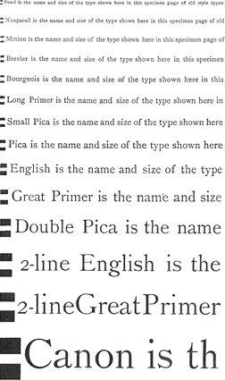
      A rough and ready way to find the average quantity of English words contained in one square inch of ordinary printed matter in "old style" type will be to use the following table:

    
Solid.
Thin leaded.
Thick leaded.
Great Primer
English
Pica
Small Pica
Long Primer
Bourgeois
Brevier
Minion
Nonpareil
Pearl
    
  8
12
15
23
27
32
38
44
59
81
  7
11
14
19
24
28
33
37
47
65
  7
10
12
16
20
24
29
33
40
55

A reference to the various specimens of types p.16 / at the end of this volume and the analysis table on page 92 will further help to form an idea of the quantity contained in any given page, set in the other founts.
      The headline for every page should be settled by the author himself. It is usual to have the short title of the work on the top of the left-hand page, and either the title of the chapter, or the subject-matter of the two pages open at the same time, on the top of the right-hand page. The former headline is useful in identifying and replacing a leaf that may have been torn out, and the latter is of frequent use to the reader, and often a very great help in compiling an intelligible index.
      It may be well to say a few words here about the Preface. It is the introductory address of the author, in which he explains the purpose and scope of his book. In these days of hurriedly-written newspaper reviews, it is useful to make the preface thoroughly explain the author's object in writing the book; for be it hinted to the budding author that in some cases this is the only part of the work read by the reviewer.
      The "preliminary matter" is usually the last to be dealt with. The correct order in which it should appear at the commencement of English books—for this does not hold on the Continent—is half-title (a leaf to protect the full title from injury); title, of course bearing the date of publication; dedication, almost obsolete now; preface, contents, and list of illustrations if there be any. p.17 / In a limited edition the certificate or guarantee of number printed should face either the half-title or title-page.
      If the work has passed through many editions, a bibliographical list with the respective dates of issue is often, and usefully, placed facing or backing the title-page, if not already occupied with some other bibliographical detail. In this connection it is most important that the precise year of publication be expressed at the foot of the title-page. To omit the year or to postdate the issue is very misleading.


p.18 /


CHAPTER  II

THE  INDEX


A
LL works are the better for an Index, and its absence in those dealing with scientific matters is frequently noticed as a great fault by reviewers. The "Athenæum" nearly always gives credit to a volume which contains a good index, and points out the omission should it be a work requiring one.
      In making an index, it is not enough for the indexer merely to understand the subject of the book but he must understand the wants of the reader: two quite distinct things. The art of finding the correct title—or, as it is called, the "catchword"—under which to describe the thing indexed, must be combined with the knowledge that under that head, and no other, will the reader most probably look for it. Hence a specialist in the particular subject of which the book treats may not compile so valuable an index as one who, while knowing less of the subject, has had more experience in the ways of readers, and the catchwords they use.
      A good index must be exhaustive; must include the various "points" of a book; must gather under one heading the same subjects; must be p.19 / concise, yet explicit; must contain the subjects of chapters, and the smaller divisions, such as sections, not merely single words as they occur; and must define each entry that occurs under the same title, so that the reader may turn at once to the desired page.
      An index cannot be commenced until the sheets as finally printed are at hand, otherwise errors in pagination are sure to occur. Supposing the sheets are at hand, the best way to commence is to have an ordinary ruled copy-book, and to make each entry as it is decided upon, writing the catchword somewhat more plainly than the subsequent definition, so as to catch the eye when turning back for reference, as is often necessary.
      Between each entry leave one line blank for the subsequent cutting up and sorting which will be necessary.
      As each entry is made, underline the word indexed in the text, if it is there, or write it in the margin if not, so that when the index proof comes to be checked with the sheets, the eye may readily catch the sought-for word.
      In front of the desk, and visible without effort, should be kept the list of cross-references. This should be written up as each heading is decided upon, and selected from one or more possible synonyms. For instance, if "Printing" is the title selected and entered on the cross-reference sheet, there will be no subsequent re-arranging required from say such headings as "Book," "Caxton," p.20 / "Fount," "Typography," for these will all be referred on the cross-reference sheet to "Printing."
      Do not imagine that it is sufficient to select mere words as they occur in the text. Entries must be made for the contents of whole chapters, sections, and paragraphs. For the indexer must give the author credit for wanting to say some special thing in each subdivision of his work, and must similarly credit the intellectual reader with—having once found that particular subject dealt with—a desire to refer to it again, although pagination and all else concerning it has vanished from his mind.
      When all the sheets have been extracted, and all the entries made in the copy-book—or it may be many copy-books—it then remains to separate the book into loose pages, and to cut with scissors along all the intermediate blank lines; then to sort the slips thus freed into alphabetical order; and then all slips with the same title in page order, commencing with the lowest. When this is done, to paste or gum them all on sheets of paper in proper order, and to revise them for the press, putting in cross-references from the sheet where a record of them has been kept, properly punctuating, eliminating duplicate headings by transferring page numbers, and otherwise giving the compositor as little trouble as possible when it comes into his hands.
      The punctuation of an index may seem a simple matter, but it may be such as to make or mar it for a bibliographic eye. To make the catchword p.21 / or heading of each entry prominent, it may be printed in a special fount, or even in italic or small capitals, or, if this be not desired—as it may involve extra expense—a good plan, which still throws up the heading a little, is to put a colon (:) after the first word. A comma should be put between the last word of an entry and the first figure of the page, and a semicolon between each entry under the same heading. Where there are several pages given to one reference, put a comma between each.
      When the index proof comes from the printer it must be checked with the pages of the book itself, for who has not known the irritation produced by an incorrect page number in an index? Many hours of labour will be saved in this dreary task if the word indexed has been—as recommended—underlined on the page itself at the time it was selected, and marginal notes made of anything not in the text.


p.22 /


CHAPTER  III

TYPES AND  MARGINS


T
HE beauty of a volume is dependent on the selection of a suitable character of type. These "founts" of type may be broadly classified into three divisions, namely:

Examples of The Old Face, Revived Old Style Face & The Modern Face
(enlargement)

      These three examples are given in large founts (double pica) to emphasize the difference in the character of the letters.
      (a)  The Old Face is occasionally used for bookwork, generally of an antiquarian character, the old-fashioned long f being sometimes used in conjunction with the ligatured letters, fi fl ff ft fh ffi ffl fk fb ct. This series was designed and cut by William Caslon, who flourished in the early part of the eighteenth century. It is closely modelled on the Dutch types used in the seventeenth century.
      (b)  The Revived Old Style is more generally used for bookwork, as a glance at most modern books will show. This volume is printed in this p.23 / style, and in the Pica size, from Messrs. Miller and Richard's series, which was designed about the middle of the nineteenth century.
      (c)  The Modern Face is more in demand for newspapers, magazines, schoolbooks, scientific works, pamphlets, and so forth. This class of type faces was mostly created in the first half of the nineteenth century.
      There are many other varieties of type, but they are mostly of a fanciful character, and not in good taste or in keeping with bookwork. However, the occasional use of 'Black Letter', italic, and a bolder face of type is permissible in order to give emphasis to certain passages. 'This fatter face of type' is sometimes called "Clarendon," and occasionally "Egyptian." This one is generally termed 'Antique Roman', and has a pretty effect, especially with old style types.
(enlargement)
      Fancy types need not be entirely rejected. Their characters are sometimes good, and their employment is appropriate for advertisements and works of a miscellaneous or commercial nature.
      The types on the following page represent the "revived old style" in some of the different sizes in general use. The black impression at the beginning of each line represents the actual depth of the type-body employed in that particular line.
      It should be remembered that pica is, when set solid, six lines to the inch. If this is taken as a standard the various other sizes, both smaller and larger, will in due time fix themselves on the mind.

p.24 /

Size and name of common types
(enlargement)


p.25 /

      Each separate kind of type is made in many sizes, each size having a special name: that of the type used in this work is "Pica." The following table shows all the ordinary sizes for book work, with their approximate dimensions and equivalents where they happen to be in proportion. There are of course larger sizes, but these lie rather outside our present scope.


SIZE.
   
Is half the
size of
   
Lines to inch
"solid."
DIAMOND
PEARL
RUBY
NONPAREIL
MINION
BREVIER
BOURGEOIS
LONG PRIMER
SMALL PICA
PICA
ENGLISH
GREAT PRIMER
PARAGON
DOUBLE PICA
    Bourgeois
Long Primer
Small Pica
Pica
English
Two-line Brevier
Great Primer
Paragon
Double Pica
Two-line Pica
Two-line English
Two-line Great Primer
Two-line Paragon
Two-line Double Pica
   
17
15
14
12
10
1/8
 9½
  8½
  7½
  7
  6
  5¼
  4¼
  3¾
  3½

      This table is based on the old system of type measurement. The American system of type bodies is gradually coming into use here. It is measured by points, taking pica=12 points, or roughly 72 points to the inch. This innovation is a good one, as each size of type bears a definite ratio to other sizes, whereas the former custom of the different English founders resulted in chaos p.26 / for, as a rule, no two founts of the same body made by different founders could be used together.
      This is an example of the point system, which speaks for itself:

Points
Points
Diamond
Pearl
Ruby
Nonpareil
Minion
Brevier
Bourgeois
Long Primer
Small Pica
Pica
English
Great Primer
=  4½ is half of 
=  5         "
=  5½         "
=  6         "
=  7         "
=  8         "
=  9         "
= 10         "
= 11         "
= 12         "
= 14         "
= 18         "
Bourgeois
Long Primer
Small Pica
Pica
English
Two-line Brevier
Great Primer
Paragon
Double Pica
Two-line Pica
Two-line English
Two-line Great Primer
=   9
=  10
=  11
=  12
=  14
=  16
=  18
=  20
=  22
=  24
=  28
=  36

      It may be as well here to explain the unit of measurement which the printer employs, and has indeed employed since the time of Caxton. It should be thoroughly understood, as it is frequently referred to in printing matters.
      Really the "em" image of 'em' is but the name for the unit which represents the actual square of the side of any particular body, and has no connection with the letter "m" excepting that it is sometimes thus abbreviated. An "en" image of 'en' is the same depth precisely, but half the width of an "em," so two ens image of two 'ens' together make one em image of 'em' This pica "em" is the standard adopted for governing the measure or width of type matter
(enlargement).The wages value of any page is p.27 / obtained by measuring the actual length and width in ems of that fount in which the volume or work is composed, this being doubled to obtain the ens, e.g., 50 x 20=1,000 x 2=2,000. This gives the number of letters in a page—the en being considered the average thickness of the twenty-six letters of the alphabet. For example, supposing the twenty-six letters of the lower-case roman alphabet (a to z) were set up in the composing stick, the total length of the complete alphabet should not be less than twelve ems of its own body; more often it is thirteen or fourteen ems. If less than twelve ems it is a "thin" fount, and the compositors are paid extra for the additional work it entails.
      That there are six pica ems to the inch should be remembered. As an illustration: the width of this page is twenty-one pica ems. Now 21/6 = 3½; therefore the print on the page is three and a half inches wide, which any rule will show it to be.
      Lines of type are frequently separated by the insertion of thin strips of lead: "solid" type is when set without "leads." This text is set up "thin leaded." Forty-eight "thin leads" go to one inch, and two are equal to one "thick lead." Therefore twenty-four "thick leads" are equal to an inch, and consequently four to the pica.
      By means of leading a volume may be spun out to almost any number of pages, and books are even double or treble thick-leaded all through. Opinions differ as to the appearance of leaded and p.28 / non-leaded matter. Undoubtedly a page of type set quite close looks pretty as a whole, but for comfort in reading, unless the type is fairly large and the page not too wide, the eyes travel more easily from the end of one line to the beginning of the next if it be leaded. In the larger dictionaries and encyclopædias the difficulty of reading across a wide page of small print is obviated by dividing the pages into two, three, or more columns.
      Where a reprint of a book is expected—as for a second edition—the expense of re-setting all the type may be saved by various processes. The principle of them all is, to take a mould of the type in some material from which a metal impress may be obtained forthwith or at any future time. This impress takes the place of the original type, and is printed from with varying results, the exact degree of quality being dependent on the process employed.
      In moulding by the patent or paper (papier-maché) process, papier-maché moulds are formed by placing several sheets of prepared paper together, pasted with a special composition. This, after being moistened, is laid on the surface of the type and then beaten with a large brush. It thus forms a "matrix," which is dried by artificial means. These moulds are then stored. When required, melted metal is poured on them, and in the "stereo-type" resulting each page is faithfully reproduced as in the original type. With care the results obtained in printing are fairly good. This is an p.29 / inexpensive method, as these moulds need not be stereotyped until they are required. Daily newspapers are all produced by means of this plan.
      A better process is the plaster, but now almost obsolete in practice. In this the matrix is formed with plaster poured over the surface of the type. This is afterwards baked, and the metal poured into it, thus giving a reproduction. This method is more satisfactory as giving a sharper and more even stereotype, but it is slower and more expensive. Music type is nearly always stereotyped by this process.
      Electrotyping is the art of duplicating by an electro-deposit of copper from a mould made in wax, which forms a mere filmy shell, afterwards backed up with type-metal to give it the requisite thickness and strength. This is more durable, but costs rather more than the plaster stereotype, which it has largely superseded. It is well adapted for works that have to be reprinted many times, because, the face being harder, a larger number of impressions are given with less wear and tear. It is always used for duplicating woodcuts, a careful electrotype being almost equal to the original block from which it is made. If woodcuts are to be preserved they should be electrotyped, and prints made only from the duplicates, the originals not being used, and carefully preserved. When worn, a fresh electrotype can always be readily taken.
      If a work is likely to run into another edition and p.30 / it becomes necessary to correct the matter somewhat extensively, some arrangement with the printer to keep the type standing is usual, because alterations in stereotype- or electrotype-plates are very expensive to make. Such type kept to special order is generally subject to a nominal rental based on a fair interest on the value of the material locked up for the time being.
      It will be seen from this that the paper process allows of tentative moulds being taken in the first place, and, if they are never used afterwards, this first cost is not of great moment. If required at some later date, these moulds are equally good for casting from, provided they have been taken good care of. In the plaster-stereotyping and electrotyping instances the plates must be made forthwith, because these moulds in either case could not be stocked without injury.
      We now approach another important feature in the appearance of a well-printed book.
      Margin is a matter to be studied. To place the print in the centre of the paper is wrong in principle, and to be deprecated. If we look at a book printed in this fashion, it is apparent to the booklover that something is amiss; for by an optical illusion its pages have the appearance of having more margin on the inner and top edges than on the outer and lower margins.
      To remedy this it is therefore necessary to have more margin on the outer than the inner side of a page, called respectively the "fore-edge" and p.31 / "back"; and less at the top, or "head," than at the bottom, or "tail."
      In fact, the two facing pages of the open book must both be taken into consideration at the same time.
      Apart from this, the larger amount of paper on the fore-edge and tail serves a double purpose. It allows of subsequent rebinding and cutting; and it also allows room for annotation. A reference to some of the best printed books of the past will show that this margin was much used in olden times for this purpose. In modern times the Kelmscott Press books may be cited as an instance, though perhaps a little exaggerated. It is also useful, as there is more wear and tear on these portions of a book. Indeed, books may be seen that have had their fore-edge actually worn away in places by incessant fingering until they are one-eighth of an inch, or more, narrower than they were originally.
      The proportion of margin depends upon the size of the book: there must be a gradual increase from a sextodecimo to a folio.
      In an édition de luxe it is well not to make the difference in size too extravagant, though no definite rules in this matter can be laid down.
      Supposing a book is printed in the revived old style type on a machine paper, it is quite permissible to print the large paper copies on a handmade paper.
      Sometimes, where the difference in size between p.32 / two editions is not very great, and the size happens to be quarto, the inner and top margins are not altered. In this case the extra paper would fall on the fore-edge and tail of the book. This plan obviates the expense of altering margins of type pages and saves the cost of a fresh making-ready on the press.
      These sizes are suggested for the difference between small and large paper editions.

OCTAVOS.
Foolscap 6¾ x 4¼
Crown 7½ x 5
Post 8 x 5
Demy 8¾ x 5
5/8
Medium 9½ x 6
Royal 10 x 6¼
may become
"    "
"    "
"    "
"    "
"    "
Crown 7½ x 5 inches.
Demy 8¾ x 5
5/8.
Medium 9½ x 6.
Royal 10 x 6¼.
Super Royal 10¼ x 6
7/8.
Imperial 11 x 7½.

QUARTOS.
Foolscap 8½ x 6¾
Crown 10 x 7½
Post 10 x 8
Demy 11¼ x 8¾
Medium 12 x 9½
Royal 12½ x 10
may become
"    "
"    "
"    "
"    "
"    "
Crown 10 x 7½.
Demy 11¼ x 8¾.
Medium 12 x 9½.
Royal 12½ x 10.
Super Royal 13¾ x 10¼.

Imperial 15 x 11.


p.33 /


CHAPTER  IV

METHODS OF  ILLUSTRATION


I
T now becomes necessary to devote some attention to what is very often the most important feature where a modern book is concerned — the illustrations.
      Within the last few years illustrated books have become more and more frequent, until at the present time very few books are published without some kind of illustration, or attempt at least, at typographical decoration. The facility with which illustrations can be produced is largely responsible for this tendency: on the other hand, the demand for "pictures" in a book has undoubtedly stimulated the development of modern methods of engraving until the variety of processes available for the purpose is positively bewildering.
      In the selection of the mode of illustration, one must be guided by whether the designs are original or whether the pictures are mere reproductions of old subjects. If the former, the drawings can be generally adapted to the requirements of the particular process to be employed, the precise method being regulated by the total expense to be incurred; whereas, in the case of reproductions, the choice would naturally be more limited. Nowadays nearly all illustrations are mechanically p.34 / produced, and the actual cost of making any blocks or plates may be taken in the following order: line process, half-tone process, collotype and other photo-mechanical gelatine methods, and, lastly, photogravure as the most expensive. It must be remembered, too, that the first two being relief processes, the blocks may be incorporated with type matter in printing, but the last two methods necessitate quite separate and distinct printings from letterpress and are best adapted for inserted plates in a volume.
      When the printed book succeeded the written and illuminated manuscript its pages were undoubtedly printed from a single block upon which had been engraved in reverse relief the characters of the required lettering. And, as such books were mainly of a devotional kind, masses or service books predominating, it was the custom to supplement the letterpress matter with a rude outline design. These were engraved on small selected planks of straight-grained pear or sycamore wood: the lines were cut by means of a knife and followed the direction of the grain of the wood, in contradistinction to the later method of wood engraving, where the blocks are cut upon the end of the grain.
      Such a method naturally did not afford much scope for the engraver, but all the extant examples of early wood engraving bear remarkable testimony to the wonderful power and resource of their designers. When the use of movable types p.35 / for printing letterpress became general, blocks were no longer required, and woodcut illustration fell into disuse. But simultaneously with the introduction of block-printing there occurred a very general extension of the practice of the art of engraving in the sense in which that term has been so universally employed.
      Such work consists in engraving a design upon the surface of a smooth plate of metal with a burin or graver. The engraved plate is inked; the surface wiped so as to leave only ink in the incised lines; then an impression is taken on soft paper in a roller press. With proper attention to the amount and quality of pressure applied, and a judicious selection of an appropriate paper and ink, engraved plates give really fine artistic results. And as line engraving was capable of such results, it was during the seventeenth and eighteenth centuries, when books were not many, and when illustrated books formed only a small proportion of the total output, the method most generally adopted. Not that illustrations were numerous: the fact that they involved a separate printing and were divorced from the letterpress effectually prevented their extended use, and generally speaking they were limited either to a decorative title-page or frontispiece.
      Such briefly was the condition of things until the end of the eighteenth century: with the dawn of the nineteenth a new era begins, and illustration becomes a more important feature in books than p.36 / previously. The invention of the art of lithography by Senefelder furnished the artist with a fresh method, and, although open to the objection already urged against line engraving, the necessity for a separate printing did not prove altogether fatal to the use of lithography for book illustration. Commonly regarded as a mysterious art, lithography is really a very simple affair, and is based upon the power of certain kinds of mineral matter to absorb fatty organic substances. A smooth-surfaced piece of porous carboniferous limestone is selected, and the opposite sides are ground so as to form a fairly uniform and flat bed of stone; one face is polished, and upon this the artist makes his drawing with a greasy pigment. When the design is finished it is usual to give a slight acid bath, or "etch the stone," as it is termed, for the purpose of imprisoning the greasy pigment within the minute pores of the surface of the stone. If the stone be damped and then rolled up with an elastic roller charged with a greasy printing ink, that ink will adhere to the design, while the damp stone will repel it. The stone can then be printed by passing it through a press fitted with a scraper.
      Before passing from this short consideration of the lithographic art, it may be useful to note that when a slightly grained instead of a polished stone is used, no more perfect method exists for faithfully reproducing in the printed impression the real character of a drawing executed in chalk or pencil, and that, by reason of the delicacy and subtlety p.37 / of the tints which can be printed from stone, lithography is extensively employed in colour-printing.
      The early part of the nineteenth century saw the revival of wood engraving, and, we may add, the end of that same century its decline. When the mediæval German and Fleming worked upon wood they cut their designs as already stated upon a longitudinal plank, and their opportunities for adequate expression of the intention of their designs were limited accordingly. But Bewick, his contemporaries and pupils, were not content with these restricted facilities: they were familiar with the work of several generations of line engravers, and realized that a much wider field was open to them if they could treat their blocks as line engravers treated their plates. Accordingly they employed a hard wood and engraved their blocks on the end of the grain. These transverse sections were trimmed and surfaced, one face being finely polished. Upon this the artist's design was drawn, and the picture made no longer with a knife but with a burin.
      The task of the wood engraver was not quite so simple as that of his brother craftsman upon metal. While the latter was required to plough the surface of his plate to produce his line, and inflection could be obtained by merely varying the pressure which he exerted, and so making a deep and wide cut or a shallow and thin one, the wood engraver had to leave his line alone, and cut out p.38 / what are known as the "whites," or the blank spaces between the lines.
      For fully half a century the superiority of wood engraving for the purpose of general book illustration was unchallenged. Artists of repute became book illustrators, but few of them had been trained as engravers or were willing to undertake the drudgery of such training, and it frequently happened that the artist, being dependent upon the engraver for the translation of his design, and the drawing being destroyed during the progress of the work, perfect results were not always forthcoming. Photography was then employed to assist the artist, and instead of drawing directly upon the wood-block he was enabled to make an independent drawing and have it transferred to the surface of the block, which had been specially sensitized for the purpose. Wood engraving was a slow process; both artist and engraver had to be employed—and paid. The cost of production was considerable, and if illustrations were to be extensively used some cheaper method of engraving must be found. Now, the lithographers had ascertained by practical experience that it was possible to use thin plates of polished zinc in the place of the ordinary lithographic stone. Transfers from the stone were made; they were laid down on zinc plates and printed from with ease and certainty. From the substitution of zinc plates for lithographic stones, a single step sufficed to convert them into relief blocks capable of being printed at a letterpress machine.

p.39 /

      All that was required was to draw upon the zinc with a greasy pigment, or one containing a resisting varnish, and then to etch the plate with acid. The whites of the design were thus bitten away, and the lines, having been protected by the varnish from the action of the acid, were untouched and remained in relief. When mounted upon a wooden or metal support of sufficient thickness, the plate could be imposed with type and printed in the ordinary way.
      We have already seen that the aid of photography was invoked by the wood engraver; it was destined to render still more important service to the process engraver. Instead of drawing directly upon the metal, the zincographer makes a reversed negative from his drawing, and having sensitized the surface of his plate proceeds to print the negative upon it. This is effected by covering the zinc plate with a thin coating of albumen, in which potassium bichromate has been dissolved. When dry the negative is exposed in contact to the action of light, and it is found that the physical condition of the sensitized albumen undergoes an important change. Where the light has penetrated the negative, the albumen has been rendered insoluble in water; where, on the contrary, the dense film of the negative prevents the passage of light, there is no alteration in the condition of the albumen. After rolling up with a lithographic ink the plate can be washed and the unprinted albumen dissolved away, the remaining portion, acted upon by light corresponding with the lines of the design, being p.40 / undisturbed. The plate is then etched, and when sufficient relief is obtained mounted and printed from in the manner already described. Modified in various particulars and improved in detail this is the ordinary line process now in common use. Where a drawing is prepared with due regard to photographic requirements it is an excellent method of obtaining at very small cost an efficient and faithful reproduction. A subject that would have formerly cost several pounds if engraved on wood, can be reproduced by line process for a few shillings, the rate for the finest work of this class not exceeding sixpence per square inch, while in a great many instances it is much lower.
      It must not be imagined, however, that line process will satisfactorily reproduce any drawing, although such a belief is commonly but erroneously entertained. The drawing must be made in a suitable manner; it must express everything the artist intends to convey, and, as a good photograph is an essential preliminary, it must be made in clear, firm, definite black lines. There must be no question as to colour, otherwise over-exposure in the negative cannot be avoided, and this results in thickened and distorted lines, or, on the other hand, in their becoming broken and rotten in the reproduction. The drawing should be rather hard; all the tone is to be obtained by cross-hatching or by tints made up of line; no wash or pencil work is admissible. Sometimes it is advantageous to make it somewhat larger in p.41 / proportion than the resulting block, but when this is done the artist must not be tempted, because he has a larger surface to cover, to put more work upon his design than would be required for a reproduction to scale. Simplicity is desirable, and the most effective pen drawings are generally those which are made with the least effort.
      The zincographic line process is very rapid in operation. Using artificial light and labour-saving contrivances in the various stages of its manufacture, a block can be completed in a very few hours; so quickly, indeed, that this process is extensively employed for daily newspaper purposes, where the entire preparation of the paper has to be completed between sunset and sunrise.
      Another process in which the block is produced by swelling a photographic print made upon a gelatine film, so as to enable a cast of the lines to be obtained in relief, was for some time extensively used in America as well as in this country. Except in the case of originals where the colour is imperfect, or for reproductions from old and stained prints of existing engravings, it possesses no advantage over the ordinary zinc method, and being more complicated in working its use has almost entirely died out.
      Artists accustomed to draw upon wood were unfettered as to technique. Sometimes they chose to indicate the precise treatment the engraver was to adopt when interpreting a design, but very fre- p.42 / quently they were content to make a wash drawing on the wood-block, and left the engraver to use his own discretion in translating the monochrome into a line engraving, for it must be remembered that for letterpress printing a definite texture of lines or dots must exist. There is a level surface exposed to pressure, and, except as modified by the making-ready, the amount and distribution of colour in the design can only be expressed by means of lines and dots of different sizes, shapes, and directions. Men familiar with line drawing were quite at home when called upon to produce drawings for photographic reproduction, but a larger and equally capable class of illustrators were at a disadvantage inasmuch as they lacked the ability to express tone properly by means of line. So the photographers turned their attention to perfecting some arrangement whereby wash or monochrome drawing should be made available for printing at letterpress, and the solution of the problem resulted in what is known as the half-tone process, the most extensively used of any existing method of illustration.
      The half-tone engraver does for the drawing in flat tint what the draughtsman in line does for himself, and his function is somewhat akin to that of the wood engraver engaged in cutting tints. In point of fact the half-tone operator converts an indefinite tint, whether in wash or pencil, or the tone of an ordinary photographic print, incapable as it stands of direct expression at the letterpress p.43 / machine, into a texture of dots and points which can be readily printed from.
      This is accomplished by very similar methods to those of the ordinary line process. There is, indeed, a close analogy between them, the only radical difference being found in the negative. A negative from an outline drawing will obviously represent that drawing exactly, the lines will appear as transparent replicas of those in the drawing, and the colour of the paper will be represented by the opaque film of the negative. In the case of a monochrome it has to be replaced by one made with a screen interposed between the drawing and the sensitive plate. The screen is a very fine piece of optical apparatus. It is composed of two sheets of plate glass absolutely free from flaws or defects of any description whatever. These are ruled by means of delicate machinery fitted with movements capable of exact mathematical adjustment so as to insure uniformity in the width both of the line itself and the spaces between the lines. The ruling on each generally follows the direction of the diagonal, and the two sheets are secured face to face and hermetically sealed. The sealing material is opaquely coloured, and when viewed against a luminous background the screen is seen to be composed of minute squares. The number of lines to the inch and the ratio between the width of line and intervening space vary. Originally screens of eighty or one hundred lines to the inch were employed, now screens of one p.44 / hundred and fifty up to two hundred lines to the inch are common, and even finer screens are used where the conditions will permit of the most careful printing. When inserted in the camera in front of the sensitive plate the action of the screen is to intercept very much of the transmitted light from the copy, and to break up the image into that mass of dots and points, which, whether conspicuous or almost imperceptible, is always present in a half-tone engraving. Having secured the negative, the later stages of the production of a half-tone block are similar to those already described in connection with line blocks. Copper has largely replaced zinc as the material used, and the various stages of re-biting require greater deftness on the part of the operator than the corresponding steps in making a line block.
      Before entirely leaving the subject of photography as applied to either letterpress or lithographic printing, a few words are necessary on the subject of colour printing, and also as to those photo-mechanical methods of printing which are sometimes used in connection with book illustration.
      Colour printing involves a number of separate blocks or stones for one subject, the number varying with the number of colours to be used. The lithographer selects from his design the appropriate colours, and, having drawn the key or general outline, he lays down a number of transfers on to separate stones. On one he will draw in so much of the tint as is necessary to obtain, say, the yellow, p.45 / and on another what is required to give the blue, and on another the violet, and so on. Each one of course is treated with sufficient inflection to convey the different strengths of colour, and again separate stones are provided for such intermediate tints as cannot very well be secured by a combination of any other colours used. All these transfers being laid down from one key they can be printed in succession in perfect register, and so the colour print is gradually built up.
      Where a long run is required, some economy is found in employing relief blocks instead of lithographic stones, or again it is sometimes advantageous to combine the two methods, and print part of the work from stone and the rest from relief blocks. The increasing tendency to produce colour work by letterpress has lately contributed to an important development of the photographic half-tone process, which is generally known as "three-coloured work." The researches of Ives and others in the field of photographic optics have demonstrated that it is possible to construct photographic positives which will discriminate natural colours.
      The photographer does this by making negatives in register on specially prepared sensitive plates so arranged that each one shall automatically select only a sympathetic colour and reject any other. In this way a negative may be obtained from any object which shall reproduce only so much of it as is coloured yellow, another shall reproduce p.46 / the blue, and another the purple. If half-tone blocks are made from these, and are printed in pigments corresponding as closely as possible with the colours selected by the respective negative filters, a fairly satisfactory result may be obtained. It is clear, however, that any such result is an approximation only, and its success depends largely upon the character of the subject to be reproduced. Natural objects as a rule present fewer difficulties than paintings or drawings in colour.
      A very brief reference to the photo-mechanical processes will suffice. They are numerous, and for fidelity of reproduction are valuable, but they involve separate printing, and in some cases this is a costly matter. The most important are the group of collotype processes, which are known by a variety of names. A collotype may be described as a mechanical print from a chemically prepared surface, and is in effect a lithograph printed from a gelatine film. In this country climatic changes are so frequent and sudden that it is difficult to rely upon the behaviour of gelatine, which is largely affected by variations of temperature, and by the amount of moisture present in the atmosphere. Very fine granulation can be employed, and therefore a collotype print is capable of expressing the most delicate textures and the lightest tints.
      It only remains now to mention the group of illustrative methods known as intaglio or incised p.47 / processes. Line engraving upon copper has been already referred to. A later development introduced the use of steel instead of copper plates, and a more delicate style of engraving became popular. During the earlier part of the last century, line and stipple engravings were used for book illustration in the case of sumptuous editions, but have now almost entirely died out. The revival of copper etching dates from the decline of line engraving. For the artist who is expert in the control of his treatment of line, no method can be simpler or more effective. Having covered a polished copperplate with a resist varnish, he draws in reverse with a sharp point the lines of his design, revealing the metal: he then proceeds to etch the plate, generally using a retarding mordant such as perchloride of iron. Not only can the width of line be varied, but its depth can also be regulated by re-covering the plate and re-biting those portions of the design which need strengthening.
      Much more restricted in its application to book illustration is the mezzotinter's art. It is a complicated process to produce a mezzotint plate, and when done the number of perfect impressions that can be relied upon is not great. A copperplate is worked upon by a tool known as a "rocker," which raises a burr like velvet-pile. The engraving is made with a scraper, the burr is reduced in height for the middle tones, and is altogether removed for the high lights of the subject, which are represented by the smooth metal. p.48 / The plate is inked and printed in the same manner as a line copperplate, but the tint obtained by the rocking is so full and deep, and of such a varied character, that a print from a mezzotint plate always presents a rich appearance, and possesses a quality unobtainable in any other way.
      The fact that every print from a copperplate involves a large amount of manual manipulation insures variety, and the introduction among the illustrations of a book of at least one printed from a plate enables it to claim a higher place among the season's editions than is allotted to others. Hence the need for a cheap and speedy method of making copperplate illustrations, which has been satisfied by the introduction of photogravure.
      In connection with relief work gelatine surfaces for electrotyping purposes have already been mentioned. The use of undulating gelatine films in conjunction with resin for granulating the plate gives the process of photogravure.
      A negative of the subject is made in the usual manner, and from this a reversed glass positive is printed. A carbon print is then made, which is laid down on a copperplate already covered with finely powdered resin. The undulations in the carbon film corresponding with the gradations of light and shade in the subject regulate the time required for a mordant to penetrate to the surface of the copperplate beneath, and permit of the more immediate action of the acid upon those parts where the carbon film is thinnest. These corre- p.49 / spond with the shadows, while the denser film indicating the lights of the subject does not permit of much, if any, chemical action. The printing texture is secured by the powdered resin, the separate grains of which prevent the uninterrupted action of the mordant and granulate the bitten area.
      Although not a particularly cheap process photogravure is an efficient and comprehensive method of securing artistic results in the way of book illustration, and for the reproduction of paintings it is unsurpassed by any of the mechanical processes. It is not unusual for us to be told that these may be dismissed as unworthy of consideration from that point of view which insists upon the individuality of the craftsman as the only criterion of artistic excellence, and photogravure has consequently received less attention than it deserves, the circumstance that much of the beauty of the finished product depends upon the skill of the retoucher being conveniently ignored. In practice the plate which requires little or no retouching is the one which soonest fails in printing.
      This closes our review of the processes available for purposes of illustration. The sketch is necessarily incomplete—it cannot pretend to be more. It aims only at giving information which will aid an inquiring reader in his search for more.


p.50 /


CHAPTER  V

PAPERS


H
AVING selected an appropriate type, and considered the illustrations, if a picture-book, the next thing is the question of Paper, of which there is an almost infinite variety.
      In its selection the nature of the work must be constantly borne in mind. To put an old-faced type on machine paper, or a modern-faced on one made by hand, is not generally appropriate. To be consistent, it is best to print old-faced type on hand-made paper, or paper of an antique character; and most certainly modern-faced type on machine paper. The intermediate series of type faces—the revived old style—may, however, without offence to the most critical, be employed on either kind of paper.
      All papers are primarily divided into two classes: the "hand-made" and the "machine-made." And each of these may be either "laid" or "wove." The hand-made may generally be recognized in the full size of sheet by having all round a raw, ragged, or rough edge—called the "deckle"—and usually by the right side being darker than the wrong. The machine-made papers have smooth, cut, or even edges, except imitation antiques, p.51 / when they may have one, or two, or even four rough edges. In the last case they are machine-made in a mould, and are apt to deceive most persons. These papers as a rule are darker on the wrong side than on the right. The laid papers are also easily identified by the wire marks or water lines, which are rendered more visible when a sheet, or part of a sheet, is held up to the light. The wove papers lack such lines. Both kinds may, however, be found water-marked with some design or trade emblem.
      Machine-made papers are made in a very great number of varieties: not only in shade of colour, but in style and quality; this latter being largely dependent upon the amount of rag. Hand-made paper is desirable where durability and quality are sought, its texture being stronger, and its properties more lasting. Hand-made papers stand an equal strain in any direction, machine-made papers in one direction only. This can be tested by tearing a small square piece of paper and floating it on water. The hand-made will turn up on all four sides, and the machine-made only on two.
      The substance of paper is regulated to a given weight per ream. For instance, the paper on which this book is printed is 32lb. demy, 516 sheets to the ream, and is a paper of the machine-made antique laid character. In selecting a paper that is of a thin substance, care should be taken to see that it is fairly opaque.

p.52 /

      The principal sizes of machine-made printing papers measure in inches:

Foolscap . . . . . . . . .
Crown . . . . . . . . . . .
Post . . . . . .. .. . .. .. .
Demy . . . . . . . . . . . .
Medium . . . . . . . . . .
Double Pott . . . . . . .
Royal . . . . . . . . . . . . .
Double Foolscap . . .
Super Royal . . . . . . .
Double Crown . . . . .
Imperial . . . . . . . . . . .
Double Post . . . . . . .
Columbia . . . . . . . . . .
Atlas . . . . . . . .. . . . . .
17
20
20
22½
24
25
25
27
27½  
30
30
32
34½
36
x  13½
x  15
x  16
x  17½
x  19
x  15½
x  20
x  17
x  20½
x  20
x  22
x  20
x  23½
x  26

      Hand-made printing papers may vary slightly.
      Most of these papers are made in the double or quadruple sizes, because the modern fashion is to print on machines of larger capacity, for the twofold object of expedition and cheapness.
      Very smooth or highly calendered papers are only recommended where the illustrations in the text absolutely require them, especially if these illustrations are of the half-tone nature; hand-made, or papers with a medium surface, being only adapted for printing illustrations of a purely outline character.
      If possible, it is better to make separate plates of all illustrations, so that a good printing paper of ordinary finish may be employed for the p.53 / letterpress portion of the work, these separate plates being afterwards inserted in their proper places by the binder.
      A word may be said here about the so-called "art papers," which are but coated with a material that contains a very large proportion of clay. These papers certainly give the best results for half-tone cuts, but they are not recommended generally if a suitable super-calendered paper can be used instead. The loading of these papers adds considerably to the weight of the volume, and the dazzling glare of such papers renders them most uncomfortable and trying to the eyes in reading.
      Other papers to be on the guard against are some of those of an advertised light-weight character. In all these there is an entire absence of strength or substance, and there is a great tendency in some of the cheaper kinds of these papers to disintegrate in the mere handling of the sheets in printing.
      As regards the cost of papers, the average quality of hand-made is approximately about three times the value of machine-made—Whatman paper being a little dearer : say four times the value of a good quality of machine-made. That used by the late William Morris for his Kelmscott Press productions was even dearer. In limited editions of a work the total amount of paper used is so small that the price is not worth much consideration. For this reason it is advisable to use the best.

p.54 /

      A ream of writing or hand-made paper usually consists of twenty quires, containing twenty-four sheets, or 480 in all; but machine-made paper generally contains 516 sheets (twenty-one and a half quires), termed "printers' reams." As long numbers are mostly printed on these papers, each ream, allowing for waste and spoilage, thus gives something more than 500 perfect copies.
      Vellum is occasionally used for very special copies of a choice work, but its first cost and the subsequent trouble and expense in printing render it truly an édition de luxe. Nowadays it is somewhat difficult to obtain that material uniform in colour, thickness, and flexibility.
      A substitute for vellum which has come into use during the past few years is the Japanese hand-made vellum paper. It is almost untearable, and its beautifully even and smooth surface is capable of receiving the finest impression. So much so, that it is largely used for printing engravings and etchings. Its cost as compared with real vellum is small, and not very much more than the best English hand-made rag paper. This paper is admirably adapted for children's toy-books, and also for sheet music, which has, as a rule, a bad habit of soon parting at the folds.
      One objection, however, to the Japanese paper is that it is not easily cleaned should it become fingered, as its surface becomes rough in the process of cleaning.


p.55 /


CHAPTER  VI

THE  SIZES OF BOOKS


I
T is a difficult matter sometimes, even for the bibliophile, to discriminate between the various sizes of Books, but the rules here laid down will be found useful and generally correct. The present day custom of making books of various odd or irregular sizes, however, is apt to increase the difficulty.
      Books are defined respectively as folio (2°), quarto (4to), octavo (8vo), duodecimo (12mo), sextodecimo (16mo), octodecimo (18mo), vigesimo-quarto (24mo), trigesimo-secundo (32mo), etc. These terms are founded upon the number of times a sheet is folded; for instance, a folio sheet would form two leaves, a quarto four, and so on. Sometimes it is difficult to distinguish, say, an octavo from a quarto; but if it is printed on a hand-made laid paper, the water-lines that run at intervals of one to two inches through the sheet (not to be confused with the wire-marks of the sheet, numbering usually eight or more to the inch) will mostly determine this. This rule should also apply to machine-made papers if the paper-maker knows his business. The signatures or letters placed at p.56 / the foot of the first, and sometimes also the third page, serve as another guide to identification.

Abbreviated
to
Pages to
one sheet.
   
Waterlines in
hand-made
Folio
Quarto
Octavo
Duodecimo
Sextodecimo
Octodecimo
Vigesimo-quarto
Trigesimo-secundo   
Fo.
4to
8vo
12mo
16mo
18mo
24mo
32mo
4
8
16
24
32
36
48
64
    vertical
horizontal
vertical
horizontal
horizontal
vertical
vertical
vertical

      Books with uncut or merely trimmed edges should measure in inches:

Octavo.
Quarto.
Pott . . . . . . . .
Foolscap . . . . .
Crown . . . . . .
Post . . . . . . . .
Demy . . . . . . .
Medium . . . . .
Royal . . . . . . .
Super Royal . .
Imperial . . . . .
   6¼
   6¾
   7½
   8 
   8¾
   9½
 10
 10¼
 11
  x  
  x  
  x  
  x  
  x  
  x  
  x  
  x  
  x  
3 7/8   

5
5
5
5/8
6

6
7/8
.  .  .  
.  .  .  
.  .  .  
.  .  .  
.  .  .  
.  .  .  
.  .  .  
.  .  .  
.  .  .  
  7¾
  8½
10 
10 
11¼
12
12½
13¾
15
  x  
  x  
  x  
  x  
  x  
  x  
  x  
  x  
  x  
  6¼
  6¾
  7½
  8
  8¾
  9½
10
10¼
11

      For books with cut edges, deduct a quarter of an inch in height, and rather less in width. If the book has been bound more than once, a greater deduction must of course be made.
      There is not always a clear understanding as to the terms used in connection with the treatment of edges.
      "Uncut edges" does not necessarily mean that they have not been opened with the ordinary p.57 / hand paper-knife, but simply that the book has not been cut down by machine, a method which sometimes sadly mars the appearance of a book. When the edges are absolutely untouched, it is perhaps better to say "unopened".
      "Trimmed edges" means that the heads have been left untouched and the fore-edge and tail merely trimmed sufficiently to make them tidy.
      "Cut edges" are those cut perfectly smooth with a machine on three sides, and possibly—even probably—with a total disregard to the margins, perhaps facilitated by the bad margins of the printer in the first instance.
      The principal use of signatures at the foot of the first page of a sheet is to guide the binder in folding; they also save the printer the trouble of referring to the pagination.
      The letters of the alphabet are used as signatures, rarely figures, omitting
J, V, W (evidently a survival of the days when Latin was the general language used in printing), and reserving A for the "preliminary" matter. If this preliminary matter exceeds a sheet, the signatures are continued with the small letters b, c, d, e, and so forth, technically called "lower case" letters, which may be either in roman or italic, as distinct from capitals or small capitals. Supposing the text of a volume exhausts the alphabet, the letters are duplicated as AA, BB, CC, or 2A, 2B, 2C, and so on.
      Occasionally the third page of a sheet bears a subsidiary signature, marked
B 2, C 2, D 2, etc.,

p.58 /

according to the signature on the first page. This is only requisite in such sizes of books as duodecimo or octodecimo, where a sheet cannot be properly folded without first cutting off and insetting a small section within the larger: this second signature indicating its position and acting as a check on its proper sheet.


p.59 /


CHAPTER  VII

BINDING


B
INDING is the last stage in the production of a Book, and the question arises—should the book have a temporary, or a permanent, binding? Paper or cloth suffices for the former, but leather is necessary for the latter.
      Taking the temporary binding first: it is important, if this is merely a tentative binding, that the edges should not be cut, but the binder or the owner should open it carefully with a knife, otherwise its size will be too small for the final and permanent covering.
      There are many ways of doing up books temporarily. They may be in loose paper wrappers, or in cloth, which is generally called publisher's binding, or "case work," the sheets being simply encased in boards. If a book is of an ephemeral character the edges may be cut at once; otherwise they should be left untouched, or merely trimmed on the fore-edge and foot.
      The proper and full title should be lettered on the back of the volume, together with the author's name, and the date at foot. This rule saves unnecessary handling when a particular book is p.60 / sought. This should be done even in a thin volume, because the lettering may be along the back. The better way is to have it lettered from top to foot, so that if the volume is placed face upwards on the shelf this back lettering is still readable. On the other hand, some prefer it to read from foot to head.
      Wire sewing should never be allowed: it tears the paper, and, frequently rusting, stains the leaves. These faults, and the excessive reduction of margins, are never forgiven by a book-lover. Cotton or silk thread should only be used.
      Where a large number of copies has been printed off, a portion only should be bound—the publishers should be consulted as to this—for there may not be a demand at first for the whole.
      The term "bound" is more strictly applied to leather work, or at least when there is some leather used in the binding—each copy being separately bound together "in-boarded" and not simply cased. There are several degrees of binding in this form: "Quarter bound," having a leather back with cloth or paper sides: this, with gilt top and cloth sides, is called "Roxburghe." "Half bound" has leather back and corners, and cloth or paper sides. "Full bound," when wholly encased in leather.
      If the volume has been printed on hand-made paper, the heads only should be cut and gilt, to prevent dirt getting between the leaves. If the fore-edge or tails are very uneven they should be very lightly trimmed, just sufficient to make them p.61 / tidy. It is a good rule, when taking such a book from its shelf, and before opening it, to blow the dust gently off the top. This accumulation of dust can only be avoided by the use of air-tight bookcases.
      Vellum and parchment are both largely used in the binding of books. They are durable, but quickly soiled.
      Expensive plates should only be stitched or pasted on to guards of strong paper or linen, as used in atlases, and then sewn in with the different sections of the work.
      Rules have been laid down for the binding of works on certain subjects, to form a library, so that each subject may be in a different and appropriate colour; but this must be left to the taste of the owner. However, some thought should be given to the nature of the work. Historical books should bear a distinct shade from those, say, on theology; dictionaries and other works of reference a different hue from poetry, and so forth.
      If the reader of this volume is interested in full bindings, he is referred to the different reports of the Committee on leather for bookbindings, formed by the Society of Arts, and issued by that society in 1901. He will there find much useful information and valuable hints as to the care of bound books.


p.62 /


CHAPTER  VIII

PUBLISHING


T
HE Book being now printed and bound—how can it be issued to the public?
      The first step is to find a suitable publisher. Many authors, even those experienced in the ways of books, employ a literary agent for this work, as they not only are able to suggest the most appropriate publisher for a book dealing with any particular subject—for some publishers make a speciality of certain subjects—but also are able afterwards to help the author in technical matters with which he may not be fully conversant. The Incorporated Society of Authors also helps with advice and offers assistance in suggesting a publisher.
      As every publisher deals with his clients in a slightly different way, it would be useless to go into details. The best advice that can be given is to approach only those who are well known.
      The author, or his agent, having decided upon a publisher, the first thing is to submit the MS. to him.
      Never call on a publisher with a MS., for no verbal explanation is ever necessary. If it cannot p.63 / and does not explain itself to him, much less will it explain itself to the public.
      When sending the copy, make it up into a flat parcel, so that there may be no folds in the paper, which are a great hindrance to reading, and never roll it into a cylindrical form, for this is even more inconvenient than folding.
      After the MS. has been sent, the author must not expect a reply by return, for although in large firms competent and special readers are retained to report on proposed works, the number of these submitted is so large that time must necessarily be taken when dealing with them. In some firms from twelve to twenty different manuscripts are received for consideration per day! and it is currently said that only ten per cent. of all the books written are ever published.
      All arrangements should be in writing, and any agreement entered into should be thoroughly understood.
      Books are by no means always commercial successes, and a publisher often runs a risk in taking a work by an unknown writer; his terms are therefore adjusted with a view to protecting himself; and the author too, if he shares the cost of production.
      A rough rule for settling the price at which most books may be sold is to treble the cost. Supposing the entire cost—printing, binding, etc.—of an edition of 1,000 to be £100, treble it equals £300, and this sum divided by 1,000=6s. p.64 / the price at which each copy may be sold; the second third being absorbed by trade discounts; and the final third profits to author and publisher respectively. This calculation is based on ordinary books, and not those sold at net prices.
      All methods of agreement between author and publisher come under one of the following five heads:
   (1)   
(2)
(3)
(4)
(5)
Sale outright.
Limited sale.
Profit-sharing.
Royalty.
Commission.
      (1)  Sale outright to the publisher is sometimes the best for the author, as he gets one cheque for all his work; saves trouble as far as possible; and avoids all dispute.
      The only difficulty of course here is to decide upon a "fair price."
      Under (2), limited sale, the author may sell his rights for a limited time, or a limited number of copies. This is not a common form of agreement.
      (3)  Profit-sharing, including in this term not only half, but all other proportions of profit, such as a quarter and three-quarters, is very simple, and should be satisfactory to the author. It has, however, almost died out, as the author is not in a position to know what the whole real profits amount to; still less therefore the amount of his own fraction. Should this system be adopted, cost p.65 / of production should not be included without investigation; American, colonial, serial, or translation rights should not be relinquished without a consideration; future work must not be promised.
      The royalty system (4) is perhaps the most popular. In this method the publisher produces the book at his own cost and pays the author a fixed royalty on the published price of every copy:
      
A.   From the beginning;
      
B.   After a certain number have been sold;
      
C.   After the sales have covered the cost of production.
      The first (
A) is to be preferred. If the ordinary 6s. novel is published on these terms with a 12½ or 15 per cent. royalty on the published price (6s.), by the time an edition of a thousand or more has been disposed of, the profits of author and publisher will be practically the same. They will, in fact, each have "half-profits."
      In publishing on commission (5), the author pays the whole cost of production, and a percentage—usually ten—to the publisher for his services as agent. This is a very large branch of the trade: many works can indeed only be published on these terms, such as some on philosophy, science, technology, poetry, and at least three-quarters of modern fiction!
      If the author be a business man and does not object to the trouble this system involves—for he should superintend all the printing and binding, p.66 / and merely send the finished copies to the publisher for sale—he will probably make more by his book if it is successful than by any other system. But then so many authors will not systematically, and twice a year, work at what they call "accounts," which must here be done to obtain satisfactory results. Care should be taken to obtain a fair cost of production, and to keep control of the advertisements, and also the sale price of the book.
      A variation of the commission system is publishing by "subscription." Subscribers are those who promise to take a copy at a certain price, and when a sufficient number have agreed, and thus practically guaranteed the author against loss, the book is put in hand and published. Expensive works—county histories and art volumes—are thus frequently produced when otherwise there would be no chance of their publication.
      Before any prospectus is issued it is very necessary that the author or editor should obtain from a responsible printer a complete estimate of the approximate cost of the volume in all respects—not forgetting to allow some margin for the inevitable extras, in the nature of small type and corrections, that spring up in the course of seeing the work through the press.
      To secure the subscription price in advance, a smaller one may be asked for at first, which will be raised on issue. If the printer is accustomed to this class of work, he can frequently impart useful information and advice.

p.67 /

      Some such form as the accompanying is generally used for soliciting subscriptions:


M .....................................................
           Please enter my name as a subscriber for ...........
cop........ of the work entitled ......................................
by ............................................ for which I undertake
to pay ...................................... on delivery [or enclose].
                                Name ..............................................
                                Address ...........................................
                                         ...............................................
Date ............................................

      This scheme may be modified if necessary. Should there be two editions, large and small paper, this should be stated, and room for choice allowed in the order-form.
      In all editions limited to a certain number of copies, a certificate should be printed in each volume stating:

*** This is to certify that only        copies of this edition have been printed, all of which are numbered [and signed].
      No.
                  Signed
..................................

      If there are two editions to be printed, they may both be expressed in the certificate, but the numbers of the two sizes can either be distinct and each start at No. I, or, if preferred, be continuous. p.68 / The large paper or special copies should come first.
      Ordinary books are frequently issued having a limited large paper edition struck off at the same time. These are generally subscribed for in the manner just mentioned.
      Directly a work is ready to be issued by the publisher, it is customary to send certain copies for review to various newspapers and journals. The character of the work must be considered before sending them out broadcast, or perhaps they may be sent where no notice will be taken of them. The publisher generally knows where to place these copies, but the author should mention any particular papers to which he desires them to be sent. Good notices of a work materially add to its success.
      Advertising a work is another very important matter. In arranging for this with a publisher, supposing it is a commission book, the author should name some limit. If the advertisement can be included with other books in a general way, the expense is not so great; but the announcement of a work singly is expensive.
      Insurance, too, must not be overlooked if the book is a commission one, and the author may either insure the stock himself, or give instructions that it should be covered.
      Presentation or gratis copies are frequently sent out in order to give the book a fillip, the copies generally allotted to the writer as "author's copies" p.69 / probably being distributed amongst his more immediate friends.
      All criticisms on the book are filed by the publisher, and use may be made of the best of them should it be necessary to send out a prospectus. Some extracts from these opinions of the press may be included in any future advertisement of the volume.
      Most publishers, and sometimes authors too, subscribe to some press-cutting agency, but it is very advisable to see that a competent firm is employed.


p.70 /


CHAPTER  IX

COPYRIGHT


H
OW long does a Book belong to the author? This may seem a strange question to ask, but is really not so. In this country, for forty-two years from the date of first publication: or while the author lives and seven years afterwards, whichever term be the longer.
      The term of copyright for a posthumous work is forty-two years from the date of first publication; the possessor of the MS. being the owner of the copyright.
      By Act of Parliament one copy of the best edition of each work, and of each subsequent edition, must be despatched at once to the British Museum, London; and four copies may be sent to Stationers' Hall for the public libraries at Oxford, Cambridge, Dublin, and Edinburgh. In the event of the work running to more than one edition, it is only necessary to send the first issue to the last four libraries, providing no additions have been made to the work. The Librarian of the British Museum and the Officer of the Stationers' Company give receipts for all copies delivered to them. If by chance any of these copies for the libraries are delayed or p.71 / overlooked, a demand is soon made, generally through the appointed agent, and must be complied with.
      Privately-printed books for presentation and not sold in the ordinary way, nor advertised, are supposed to be exempt from the demands of the libraries, though a copy is often sent voluntarily to the British Museum.
      With regard to Registration at Stationers' Hall, this stands in a somewhat peculiar position. For some time after printing was first introduced into this country, copyrights were almost exclusively the property of members of the Stationers' Company, and the governing body, to prevent disputes, made a rule requiring all their members to enter their "copies" in the register kept at Stationers' Hall. This register, commenced in the early fifteenth century, has been continued to the present time, at first under a private ordinance of the company, subsequently continued in accordance with the decrees of the Star Chamber, and afterwards in accordance with the provisions of divers Acts of Parliament. Under the present Copyright Act, which was passed in 1842, registration is not a compulsory matter, but should anyone desire to bring an action for infringement of his copyright he must first register his book and the exact date of first publication. A five-shilling fee is payable to the Registering Officer when the application is made, and the title of the Book is then entered on the Register.

p.72 /

      It is essential that the precise terms of the Statute be complied with, and upon application to "The Registrar, Stationers' Hall, London," he will forward full printed instructions, the following extract from which will be found useful:

      Mode of Registration.—A proprietor of copyright desiring to register at Stationers' Hall must lodge there a demand signed by him and witnessed, in the form printed on the back thereof, together with a fee of 5s. for each entry.
      Special care should be taken that the full and proper title of the book, and the correct day, month, and year of first publication are entered, as any error or omission may invalidate the entry.
      A book cannot be registered before it is published.
      A proprietor of the copyright in an encyclopædia, review, magazine, periodical work, or other work published in a series of books or parts, will be entitled to all the benefits of registration upon his registering the first volume, number, or part.
      Assignments.—Registered copyrights, or any share or shares thereof, may be assigned, without payment of any stamp duty, by the registered proprietor lodging, at Stationers' Hall, an entry signed by him in the form prescribed by the Statute, together with a fee of 5s. Forms of Assignment can be obtained at Stationers' Hall.
      Certified Copies of entries are supplied on payment of a fee of 5s. each, and such copies are primâ facie proof of the matters alleged therein.
      Searches.—A printed Lexicographical Index of all Literary Works registered between 1842 and 1897 is now provided for the use of persons desirous of searching the Book Register. The statutory fee for each entry searched for is 1s.

p.73 /

      British Possessions.—Books first published in any British Possession which does not provide for registration should be registered at Stationers' Hall.
      International Copyright.—Under the provisions of the Berne Convention, books copyright in Great Britain are protected in the following countries:—Belgium, France, Germany, Italy, Spain, Switzerland, Tunis, Hayti, Luxembourg, Monaco, Montenegro, and Norway.
      United States, &c.—To secure copyright in Great Britain of works intended to be published in America and other foreign countries (except the Kingdoms and States represented in the Austrian Reichsrath) which have not adopted the provisions of the Berne Convention, simultaneous publication in both countries is essential, and the work should be registered at Stationers' Hall, and one copy delivered to the British Museum, and four copies lodged at Stationers' Hall for the Public Libraries. The name of the British publisher and place of publication must in all cases be entered in the register.
      Foreign Reprints.—Proprietors of books first composed, or written, or printed in the United Kingdom, desiring to prevent the importation of foreign reprints, must give notice in writing to the Commissioners of Customs, accompanied by a statutory declaration that the copyright subsists, and when it will expire. Registration at Stationers' Hall is also necessary before duties can be levied for the benefit of the proprietor of copyright on foreign reprints of British copyright works imported into the Bahamas, Barbados, Bermuda, British Guiana, Cape of Good Hope, Grenada, Jamaica, Natal, Nova Scotia, Newfoundland, Prince Edward Island, St. Christopher, St. Lucia, and St. Vincent.

      It should be noted that one of the conditions of copyright being granted in the United States is p.74 / that a work must be printed from type actually set up in America.
      As before said, in the case of omission to register a work in this country, and there is a presumed infringement of any work, priority of publication is generally accepted as evidence, providing the demands of the five public libraries have been met.
      Although the Act of Parliament does not require a book to be registered at Stationers' Hall immediately after publication, it is a wise and prudent course to adopt, as, if delayed, difficulties often arise in supplying the needful particulars in after years; and when once registered, transfers of the copyright are exempt from stamp duty, whether the consideration for the transfer be in tens or hundreds or thousands of pounds.


p.75 /


A SHORT GLOSSARY

OF BIBLIOGRAPHICAL AND TYPOGRAPHICAL TERMS IN
MORE GENERAL USE.


A
DDENDA (pl.), Addendum (s.).—An addition to any work.
Advance sheets or (copies).—Sometimes supplied for simultaneous publication, or preliminary notices.
Ampersand.—A corruption of the words "and per se and"—the short sign being & or &.
Antiqua.—A German expression for roman types.
Antique Roman.—A somewhat heavy face of type, a fashion which the Kelmscott Press books suggested. See specimens at the end of this volume.
Arabic figures.—Ordinary figures, roman or italic, thus—1 2 3, etc., as distinct from roman numerals, i, ii, iii, etc.
Art paper.—Coated papers adapted for half-tone block printing are usually, but inappropriately, so called.
Atlas.—A size of paper, 36 x 26 inches. Folio, 26 x 18; quarto, 18 x 13; octavo, 13 x 9.
Author's proof.—A proof bearing corrections made by the author or editor. A. P. is the short expression.

Backs.—The "back" margin of pages—that margin next the binding.
Bastard title.—A fly- or half-title before the full title of a work.
Black-letter.—A general expression used to indicate 'old English' in blackletter type (enlargement) gothic text, or church type.
Bleed.—When a book or pamphlet has been cut down too much, so as to touch the printed matter, it is said to "bleed."
Blind blocked (or tooled).—Simple impressed lettering on bookcovers, not inked or gilt.
Blind P (or paragraph mark ¶).—Frequently used in old printed books.

p.76 /

Blocks.—A general term embracing woodcuts, electros, etc.
Body of the work.—The text or subject-matter of a volume is thus described, to distinguish it from the preliminary, index, appendix, and notes.
Bolts.—The folded or doubled edge of paper at the head and fore-edge.
Bottom notes.—Footnotes are sometimes so called, to distinguish them from sidenotes.
Bourgeois.—Pronounced Burjoice; a size of type having eight and a half lines to the inch.
Bracket.—A square sign [ as distinct from the round sign ( or parenthesis. The bracket is sometimes used by the printer to indicate a new paragraph.
Brevier.—Pronounced Bre-veer; a size of type having nine and a half lines to the inch.
Broadside.—A sheet printed on one side only, such as a poster.

Calendered paper.—Paper very highly rolled or glazed, much used for printing illustrations.
Cancel.—A term used for a new leaf or leaves reprinted in consequence of some error or defect.
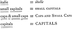
Capitals.—Letters thus, CAPITALS. Shortly called "caps."
Caps. and Small Caps.—CAPITALS and
SMALL CAPITALS.
Caret.—The sign ^ used to indicate an insertion in MS. or proofs.
Catchline.—The bottom line of a page, containing the "catchword" only, which is the first on the next page—now almost obsolete.
Catch-word.—See above; also the first word in an index entry.
Certificate.—A guarantee of a limited number of copies only having been printed of any work, usually placed near the title-page.
Circuit edges.—Books, generally bibles or prayer-books, with the covers projecting and turned over, so as to protect the edges.
Clarendon.—Generally 'a bold or fat-faced type; the older founts were called "Egyptian."
Clean proof.—One ready to be sent out to the author: not a printer's first proof.

p.77 /

Clean sheets.—Sheets put aside as they are printed off to show the progress of the work.
Cliché.A stereo or electrotype plate.
Cloth boards.—Books bound in cloth cases.
Cobb paper.—A paper in various shades of colour largely used by binders for the sides of books.
Collotype.—A method of printing from a slightly raised gelatine film produced by photographic means.
Colophon.—An inscription, device, or tailpiece at the end of a book, usually a printer's imprint.
Columbia.—A size of paper, 34½ x 23½ inches. Folio, 23½ x 17¼; quarto, 17¼ x 11¾; octavo, 11¾ x 8
5/8.
Copperplate.—A term applied generally to those methods of illustration by intaglio, as distinct from blocks in relief.
Copy.—Manuscript for the printer.
Corrigenda (pl.), Corrigendum (s.).—A table containing corrections at the end or commencement of a work.
Cropped.—A book with pages cut down too much is said to be "cropped".
Crown.—A sheet measuring 20 x 15 inches. Folio, 15 x 10; quarto, 10 x 7½; octavo, 7½ x 5.
Cursive.—The German expression for italic types.
Cut edges.—A book with pages machine-cut on the three edges.
Cut-in notes.—Those inserted within the text at the side, and not in the margin.

Dead reprint.—An absolute facsimile reprint, line for line and page for page.
Decimo-sexto.—The same as sixteenmo, q.v.
Deckle.—The raw, rough edge of hand-made paper.
Dele (or delete).—To expunge, cancel, delete, or omit, indicated thus
d.
Demy.—A size of printing paper, 22½ x 17½ inches. Folio, 17½ x 11¼; quarto, 11¼ x 8¾; octavo, 8¾ x 5
5/8.
Diamond.—A size of type having seventeen lines to the inch.
Double Crown.—A sheet measuring 30 x 20 inches; double the size of Crown, which see.
Double foolscap.—A size of printing paper, 27 x 17 inches; double the size of Foolscap, which see.

p.78 /

Double Pica.—A size of type having three and a half lines to the inch.
Double pott.—A size of paper, 25 x 15½ inches; double the size of Pott, which see.
Dropped heads.—First pages of chapters, printed lower down the page than ordinarily.
Dummy copy.—One generally made of blank leaves, to represent the bulk of a work.
Duodecimo.—Commonly called twelvemo. A book having twelve leaves to the sheet. Written 12mo.
Dutch papers.—Van Gelder's hand-made papers, made in Holland.

Edition de luxe.—An elaborate, costly and limited edition on large paper.
Egyptian.—See "Clarendon."
Eighteenmo.—A book having eighteen leaves to the sheet, written shortly 18mo. Bibliographically termed "octodecimo".
Electrotyping.—A means of duplicating woodcuts, etc., by an electro deposit of copper, which is afterwards backed up by a kind of type metal.
End leaves (or papers).—The blank flyleaves at each end of a book.
English.—A size of type having five and a quarter lines to the inch.
Errata (pl.), Erratum (s.).—A list of errors, not necessarily printers' errors.
Even pages.—The left-hand or verso pages of a book.

Fine paper edition.—The best edition of a book; sometimes expressed by the letters F. P.
Finishing.—The lettering or tooling on a book-cover.
Flat pull (or impression).—A simple proof without under- or over-laying.
Flexible.—A style of binding which allows the book to open quite flat.
Flyleaf.—A blank leaf at each end of a book.

p.79 /

Fly-title.—The half-title in front of the general title, or the one dividing sections of a work.
Folio.—A sheet of paper folded in two leaves only.
Foolscap.—A sheet measuring 17 x 13½ inches. Folio, 13½ x 8½; quarto, 8½ x 6¾; octavo, 6¾ x 4¼.
Fore-edge.—The edge of a book opposite the binding.
Format.—The bibliographical expression for the size and shape of a book.
Forme.—A printer's term for a number of type-pages imposed in an iron frame called a "chase."
Forwarding.—The different stages in binding between the sewing and finishing of a book, i.e., lettering the title, colouring or gilding the edges, etc.
Fount.—Pronounced font. The whole number of letters, etc., in one complete set of type.
Foxed.—Paper or books which are stained or mouldy.
F. P.—The short abbreviation for fine paper copies of a work.
Fractur.—The German expression for their text or black-letter characters.
Frontispiece.—The picture or plate facing the title-page of a book.
Full bound.—A book wholly bound in leather.
Full point.—The printers' expression for a full stop.

Galley proofs.—Those supplied in slips about two feet long, before the matter is made up into pages.
Gilt tops.—Books with the top edges cut and gilt, to prevent them being soiled by the dust which collects there.
Gratis copies.—Those copies not sold, but sent out for presentation, review, etc.
Great Primer.—A size of type having four and a quarter lines to the inch.
Guarded.—Books are said to be "guarded" when the plates are mounted or sewn on guards (as maps are), instead of being stitched or pasted in the ordinary way.

Hair leads.—Very thin leads for spacing out printed matter. Frequently they measure sixteen to a pica, or ninety-six to an inch.

p.80 /

Hair space.—The thinnest space made for placing between words.
Half bound.—Books bound with leather back and corners and cloth or paper sides.
Half-title.—The short title in front of the full title.
Half-tone blocks.—Photographic relief printing blocks, produced with the aid of a screen, which breaks the picture up into various tones.
Heads.—The margin at the top of the page.

Imperfections.—Sheets required by a binder to complete books imperfect through bad gathering, collating, or spoiled sheets.
Imperial.—A size of printing paper, 30 x 22 inches. Folio, 22 x 15; quarto, 15 x 11; octavo, 11 x 7½.
Imposition.—A term applied generally to the laying-down of the pages in certain positions, to form, when printed, quartos, octavos, etc.
Imprint.—The printer's name and address in a book, which is necessary by Act of Parliament.
Indent.—To set back any line or lines, as in the commencement of a paragraph.
In quires.—Unbound books in sheets.
In slip.—Galley-proofs printed before making-up into pages.
In the press.—A work in the course of being printed is thus announced.
India paper.—A fine paper used for engraver's proofs. It is generally imported from China, though called "India."
India rubbered.—Books with plates are sometimes coated at the back with a solution of india rubber to save stitching or expense of guarding: when open the book will lie perfectly flat.
Inferior figures and letters.—Made to range at the bottom of a letter, thus—1 2 3 a e i o u
Initial letters.—Large block or floriated letters used at the commencement of a chapter or work.
Inset.—A sheet, or part of one, placed inside another sheet to complete sequence of pagination.
Intaglio.—A term used for printing from an incised copperplate; the reverse of ordinary or "relief" printing.
Italic.—The sloping characters, distinct from roman types, invented by Aldus Manutius, the Venetian printer.

p.81 /

Japanese paper.—Hand-made paper with a vellum surface manufactured in Japan.
Justification.—The exact spacing out to a given measure in type-setting.

Keep standing.—An order not to distribute the type, pending possible reprinting.

Laid paper.—Those papers that show, when held up to the light, parallel waterlines, at intervals of an inch or so.
Large paper.—The best copies of a work with large margins, etc. ; also termed édition de luxe. Sometimes expressed by the initials L. P.
Leaded matter.—Lines of type separated by leads, or narrow strips of metal.
Leatherette or Leatheroid.—An imitation of leather, usually made of embossed paper.
Leaves.—Must not be confused with pages, because the leaf being printed on both sides is equal to two pages.
Letter paper.—A term for quarto paper: note paper being octavo.
Letterpress.—Matter printed from type as distinct from lithographic or plate printing.
Ligatures.—Tied letters cast on one body, thus,
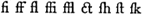
 Example of ligatures, fi ff fl ffi ffl ct fh ft fk, etc.
Line process block.—A direct photographic relief printing block, suitable for ordinary work in line, or drawings in "black and white."
Lining papers.—Papers used by bookbinders for pasting down on and inside the covers.
Literals (or letterals).—Single errors by the printer in setting up type—a first proof is usually well sprinkled with such before it is submitted to the author.
Lithography.—Printing from the surface of a smooth but porous stone, invented by Aloys Senefelder over one hundred years ago.
LL.—The abbreviation for "leaves" in a book.
Long Primer.—A size of type having seven and a half lines to the inch.

p.82 /

Lower-case letters.—The small letters, a, b, c, d, e, f, g, etc., not capitals.

Mackle.—A printed sheet with a slurred appearance, owing to some mechanical defect in the impression.
Make-up.—To measure off matter into pages.
Marbled edges.—When the cut edges of books representmarble.
Margin.—The blank paper surrounding a page of print.
Marginalia.—The bibliographical term for marginal notes.
Medium.—A size of printing paper, 24 x 19 inches. Folio, 19 x 12; quarto, 12 x 9½ octavo, 9½ x 6.
Mezzotint.—An elaborate but effective method of illustration from an intaglio copperplate engraved by hand.
Minion.—A size of type having ten and one-eighth lines to the inch.
Modern face type.—That class oftype mostly used in newspaper printing. See specimens at the end of this volume.
Moulds.—The preliminary stage in stereotyping by the paper process. They are also used for plaster work and electrotyping.
Movable.—A general term applied to type to distinguish it from stereotype, etc.

N. D.—An abbreviation denoting "no date" on a book.
Nonpareil.—A size of type having twelve lines to the inch.
Note papers.—Papers octavo in shape, but of various sizes; letter papers being quarto shape, and also of various sizes.
N. P.—An abbreviation for new paragraph, either in MS. or in corrected proof.

Octavo.—Shortly written 8vo. A book having eight leaves to the sheet.
Octodecimo.—Written shortly 18mo. A book having eighteen leaves to the sheet.
Odd pages.—The right-hand or recto pages of a book.
Off-cut.—That part of the sheet which has to be cut off in order that the sheet may be folded correctly, as in a "twelvemo."
Off-set.—The set-off of ink from one sheet to another, a result of bad ink or insufficient drying.

p.83 /

Old English.—Founts of type of  'black-letter' in blackletter font  character. Sometimes expressed by O. E.
Old face type.—That class of type designed and cut by William Caslon in the early part of the eighteenth century. See specimens at the end of this volume.
Old style type.—Generally used for the best class of bookwork, and known as the "revived old style." It was first designed and cut by Messrs. Miller and Richard about the middle of the nineteenth century. See specimens at the end of this volume.
O. P.—An abbreviation for "out of print."
Overcast.—A particular kind of book-sewing which allows the book when open to lie flat.
Overlays.—The making-ready of an illustration by cutting out varied thicknesses of paper to give light and shade to the design by altering pressure upon the block.
Overplus.—The "plus" or "over" copies of a definite number in printing.

P.—An abbreviation for the word "page." The plural is "pp."
Page.—This must not be confused with a leaf or leaves. Each leaf, being printed on both sides, is equal to two pages.
Paragon.—A size of type having three and three-quarter lines to the inch.
Paste-downs.—The blank flyleaves, sometimes coloured, at each end of a book, which are pasted down on the covers.
Pearl.—A size of type having fifteen lines to the inch.
Photogravure.—A mechanical intaglio process superseding the hand-engraved copperplate.
Pica.—A size of type having six lines to the inch.
Pointing.—The general term used by printers for punctuation. "Stiff pointing" is matter well peppered with commas and other punctuation marks.
Points.—All marks of punctuation.
Post.—A size of printing paper, 20 x 16 inches.
Pott.—A sheet measuring 15½ x 12½ inches. Folio, 12½ x 7¾; quarto, 7¾ x 6¼; octavo, 6¼ x 3
7/8.
Preliminary.—Any matter coming before the main body of a work—title, preface, contents, etc.

p.84 /

Press proof.—The final proof marked by the author or editor "press."
Prima.—In reading a work sheet by sheet the first word of the ensuing signature is marked by the reader as the "prima."
Process blocks.—Illustrations produced by photography, and mechanical or chemical processes.
Proof.—A trial print from type, plates, or blocks.
Proof.—A bookbinder's term for some rough edges left on a trimmed book, to show that it has not been cut down excessively.
Publisher's binding.—Cloth binding.

Quad papers.—Those papers made in large size, such as quad crown, 30 x 40 in.—four times the size of crown, 20 x 15 in.
Quadrat.—Blank pieces of metal used by the printer to fill up short lines.
Quarter bound.—Books bound with the back only of leather.
Quarto.—Written shortly 4to. A book having four leaves to the sheet.
Quaternions.—Printed sheets folded and insetted in sections of four.
Query.—A mark (?) made by the corrector of the press to call attention to a possible error.
Quinternions.—Printed sheets folded and insetted in sections of five.
Quire.—Twenty-four sheets of paper.
Quires.—Unbound books in sheets are said to be in quires.

Ream.—Paper in parcels or bundles of a certain size, a printer's ream being 516 sheets. Hand-made and drawing papers may contain 472, 480, or 500 sheets.
Recto.—The right-hand pages of any book.
Register.—The adjustment of print on one side of a leaf to that on the other.
Relief printing.—Letterpress and block printing, as distinct from lithography or plate printing.
Removes.—The difference between one size of type and another.
Retree.—The rejected or slightly damaged paper of different reams, marked x x. Distinct from outsides or "broken," marked x x x

p.85 /

Revise.—A proof bearing author's corrections, which has to be submitted again before being set to press.
Revived old style type.—See "Old style type."
Roman.—The class of type (such as this fount) distinguished from italic or fancy types. It is called "antiqua" by the Germans.
Roman numerals.—i, ii, iii, iv, etc. The pagination of the preliminary matter of a volume is generally thus expressed.
Roxburghe binding.—A quarter-bound book with top edge gilt.
Royal.—A size of printing paper, 25 x 20 inches. Folio, 20 x 12½; quarto, 12½ x 10; octavo, 10 x 6¼.
R.P.—An abbreviation for "reprint."
Rubricated.—Printed in red ink.
Ruby.—A size of type having fourteen lines to the inch.
Runners.—Figures or letters placed down the side margin of a page to indicate the position of any given line.

Script.—Type similar in character to handwriting.
Serif.—The fine lines on the top and bottom of a letter, as in H. A sanserif is
H.
Set off.—When the ink transfers from one sheet to another.
Sextodecimo.—A bibliographical term for 16mo.
Shoulder notes.—Marginal notes placed at the top corner of the page.
Sidenotes.—Notes in the side margin, distinct from "footnotes".
Signature.—The letter or figure at the foot of the first page of a sheet, used to identify any particular sheet.
Sixteenmo.—Written shortly, 16mo. A book having sixteen leaves to the sheet, usually about 4½ x 7 inches.
Size copy.—A thickness or dummy copy of blank paper to show a specimen of size and binding.
Slips.—Matter pulled as proofs in long slips, and not made up into pages.
Small capitals.—The
SMALLER CAPITALS, as distinct from full CAPITALS, indicated in MS. by underlining with two strokes.
Small paper.—The ordinary copies of a work. Sometimes expressed by the initials S. P.

p.86 /

Small Pica.—A size of type having seven lines to the inch.
Sprinkled edges.—Cut edges of books finely sprinkled with colour.
Stabbed.—A cheap form of stitching by piercing or stabbing, used mostly for pamphlet work.
Standing matter.—When a volume has been printed off and kept standing in type by order.
Start.—Leaves of books are said to "start" when they are loose through defective sewing.
Stereotypes.—Plates cast in metal from movable types, either by "plaster" or "paper" processes.
Stet.—A Latin word written in the margin to cancel any alteration, dots being placed underneath the alteration itself . . . .
Style of the house.—Methods of setting titles, quotations, spellings, etc., peculiar to each printing office.
Sub-title.—The bastard- or half-title placed before the general title. Same as "fly-title."
Super-calendered paper.—Highly rolled paper for dry printing.
Superior letters and figures.—Small letters cast at the top of type, and used for references or abbreviations, Mr, No, 1 2 3.
Super royal.—A size of printing paper, 27½ x 20½ inches. Folio, 20½ x 13¾ ; quarto, 13¾ x 10¼ ; octavo, 10¼ x 6
7/8.
Swash letters.—Seventeenth-century italic capitals with tails and flourishes, thus—Letters 'A B D M N' in swash-style font etc.

Tails.—The bottom or tail-end of a page.
Ternions.—A bibliographical expression for three sheets folded together in folio.
Thick leads.—Strips of metal one twenty-fourth of an inch in thickness, used for separating lines of type.
Thickness copy.—A thickness or dummy copy of blank paper to show a specimen of size and binding.
Thin leads.—Strips of metal one forty-eighth of an inch in thickness, used for separating lines of type.
Thirty-twomo.—Written shortly 32mo. A book having thirty-two leaves to the sheet.
Three-colour process.—The method of printing any coloured picture by the use of the three primary colours superimposed

p.87 /

on each other—the blocks being automatically dissected for the purpose in photographing.
Transpose.—Letters or words to be re-arranged as indicated on a proof. Written shortly "trs."
Trigesimo-secundo.—The bibliographical term for "thirty-twomo."
Trimmed edges.—Edges of books cut or trimmed sufficiently to make them tidy without opening head-folds or bolts.
Turned commas.—These are used at each end of an extract or quoted matter. Sometimes called "inverted commas" or "quotation marks."
Twelvemo.—Written shortly 12mo. A book having twelve leaves to the sheet. Also called "duodecimo."
Twenty-fourmo.—Written shortly 24mo. A book having twenty-four leaves to the sheet. Bibliographically termed "vigesimo-quarto."
Two-line letters.—Plain initial letters occupying two lines in depth, used at the commencement of a chapter or work.
Typography.—The art or style of printing from movable letters.

Uncut edges.—Leaves uncut by machinery, not necessarily "unopened" by hand.
Unopened edges.—Applied to books the edges of which have not been opened.

Verso.—The reverse or back of a leaf; the left-hand page of a book; the reverse or opposite of "recto."
Vigesimo-quarto.—The bibliographical term for "twenty-fourmo."
Vignettes.—A class of illustration with the edges undefined and shaded off gradually.

Waste.—Surplus odd sheets of a book beyond the plus copies.
Watermark.—The wire-mark of any particular design woven in a sheet of paper.
White.—The space between any lines or words of type.
White edges.—Edges of books machine-cut, not coloured or gilt.
White out.—To space or "branch out" any composed matter, such as in advertisements.

p.88 /

White paper.—Unprinted paper, whether white or tinted.
Whole-bound.—Books bound entirely in leather, of any kind.
Wire-mark.—Those "laid" marks in paper visible when the sheet is held up to the light.
Woodcuts.—Pictures cut by a knife on wood with the grain, not on the end grain as in modern wood-engraving.
Wood-engraving.—The modern form of illustration on wood, that is, engraved on the end grain of the wood, not cut with the grain.
Wrong fount.—Letters mixed with, but not belonging to, the same fount. W.F. is the short form.

Xylography.—The cutting and printing of old block-books.

Zincography.—The art of producing engravings on zinc by a chemical process.


p.89 /


SPECIMENS OF MANY TYPES


p.90 /


I
N giving these specimens of book-founts, and other examples of simple display types suitable for titles, etc., I have introduced a new feature, which I venture to think will be appreciated by both Authors and Publishers. I have taken a standard writer—Ruskin, in "Sesame and Lilies"—and repeated the same passage in every panel, in order that the comparisons may hold good in each case. These panels have been arranged, as far as possible, 2 inches deep, and are set 3½ inches wide in all cases. Thus 2 x 3½ = 7. If the total number of words quoted at the end of each specimen is divided by seven, the average contained in a square inch in any one size of type, leaded or solid, is arrived at by a very simple process. It will be observed that there is a difference between the several classes of types shown, and it will therefore be necessary to select the particular series required, in order to obtain the approximate number of words in a square inch. This can be verified by a reference to the table on page 92.


p.91 ]


INDEX OF TYPES

 Old Face. 
 Old Style. 
 Antique. 
 Modern.
GREAT PRIMER .
E
NGLISH . . . . . .
P
ICA . . . . . . . . .
S
MALL PICA . . .
L
ONG PRIMER .
B
OURGEOIS . . .
B
REVIER . . . . . .
M
INION . . . . . .
N
ONPAREIL . . .
P
EARL . . . . . . . .
93
94
95
96
97
98
99

100
101
102
103
104
105
106
107
108
109
110
111

112

113

114

115
116
117
118
119
120
121
122
123
124
125

Various.
OLD FACE ROMAN CAPITALS .  .  .  .  .  .  .  .
O
LD STYLE ROMAN CAPITALS .  .  .  .  .  .  .
M
ODERN ROMAN CAPITALS .  .  .  .  .  .  .  .
O
LD FRENCH ROMAN CAPITALS .  .  .  .  .  .
F
LEMISH ROMAN CAPITALS .  .  .  .  .  .  .  .  .
O
LD FACE ITALIC .  .  .  .  .  .  .  .  .  .  .  .  .  .  .
O
LD STYLE ITALIC .  .  .  .  .  .  .  .  .  .  .  .  .  .  .
M
ODERN ITALIC .  .  .  .  .  .  .  .  .  .  .  .  .  .  .  .
O
LD ENGLISH BLACK LETTER .  .  .  .  .  .  .  .
D
UTCH BLACK LETTER .  .  .  .  .  .  .  .  .  .  .  .
T
UDOR BLACK LETTER .  .  .  .  .  .  .  .  .  .  .  .
V
ENETIAN TEXT BLACK LETTER .  .  .  .  .  .   
126
127
128
129
130
131
132
133
134
135
136
137

p.92 /

ANALYSIS OF TYPES

CLASS.
AVERAGE WORDS IN A SQUARE INCH
   Thick leaded.     Thin leaded.     Solid.    
OLD FACE.
     GREAT PRIMER  .  .
E
NGLISH  .  .
P
ICA  .  .
S
MALL PICA  .  .
L
ONG PRIMER  .  .
B
OURGEOIS  .  .
B
REVIER  .  .
N
ONPAREIL  .  .
  7
11
14
17
21
25
31
44
.   .
.   .
.   .
.   .
.   .
.   .
.   .
.   .
  8
12
15
19
23
29
35
52
.   .
.   .
.   .
.   .
.   .
.   .
.   .
.   .
  9
14
16
23
27
34
39
66
OLD STYLE.
     GREAT PRIMER  .  .
E
NGLISH  .  .
P
ICA  .  .
S
MALL PICA  .  .
L
ONG PRIMER  .  .
B
OURGEOIS  .  .
B
REVIER  .  .
M
INION  .  .
N
ONPAREIL  .  .
P
EARL  .  .
  7
10
12
16
20
24
29
33
40
55
.   .
.   .
.   .
.   .
.   .
.   .
.   .
.   .
.   .
.   .
  7
11
14
19
24
28
33
37
47
65
.   .
.   .
.   .
.   .
.   .
.   .
.   .
.   .
.   .
.   .
  8
12
15
23
27
32
38
44
59
81
ANTIQUE ROMAN.
     GREAT PRIMER  .  .
P
ICA  .  .
L
ONG PRIMER  .  .
B
REVIER  .  .
N
ONPAREIL  .  .
  5
11
16
26
36
.   .
.   .
.   .
.   .
.   .
  6
12
20
29
42
.   .
.   .
.   .
.   .
.   .
  7
14
23
33
53
MODERN.
     GREAT PRIMER  .  .
E
NGLISH  .  .
P
ICA  .  .
S
MALL PICA  .  .
L
ONG PRIMER  .  .
B
OURGEOIS  .  .
B
REVIER  .  .
M
INION  .  .
N
ONPAREIL  .  .
P
EARL  .  .
  6
10
12
16
20
24
26
32
37
52
.   .
.   .
.   .
.   .
.   .
.   .
.   .
.   .
.   .
.   .
  7
11
14
19
24
27
31
37
44
62
.   .
.   .
.   .
.   .
.   .
.   .
.   .
.   .
.   .
.   .
  8
12
15
23
27
31
35
43
55
78
N.B.—Fractions under one-half omitted. One-half or more
reckoned as a unit.


[Pages 89 to 137, which contain the chapter SPECIMENS OF MANY TYPES, are here placed in a separate document.]


p.138 /


SAMPLES OF VARIOUS PAPERS

T
HE accompanying leaves of machine- and hand-made papers are given as specimens of papers of fair qualities, and they are here classed in their order of value—machine-made papers first, and those handmade in the second division—each kind being graded according to its value, which is based firstly on quality and secondly on weight. Papers being sold at so much per pound, the exact cost of a ream of paper is dependent on its size and gross weight. The paper on which this book is printed is ordinary antique laid 32 lb. demy. Machine papers can be made to any size, but the moulds for handmade papers only exist in certain dimensions.
      Most of the papers shown here may be obtained from stock in several sizes. If they have to be made, colour and weight can be altered in most cases, and the length of time for making machine papers is usually one to two weeks—handmade papers possibly four to six weeks.


p.139 /


INDEX OF PAPER SAMPLES

Machine made
PAGE
140
141
142
143
144
145
146
147
148
149
150
   ORDINARY WHITE SHADE.
          "       
CREAMY    "
          "       
TONED      "
          "       
ANTIQUE LAID, DECKLE EDGE.
          "                      
WOVE,       "         ".
L
IGHT BULKING ANTIQUE LAID.
      "                      "         
WOVE.
S
UPER-CALENDERED SURFACE.
E
NAMELLED (SO-CALLED " ART").
C
HROMO SURFACE.
P
LATE PAPER.

Handmade
151
152
153
154
155
156
157
158
159
   FRENCH.
D
UTCH, VAN GELDER, CREAM SHADE.
      "                "           
TONED     "
E
NGLISH, SPALDING AND HODGE.
       "       A
RNOLD AND FOSTER.
       "       W
HATMAN (W. AND R. BALSTON).
       "       B
ATCHELOR AND SON.
       "       O. W. P
APER AND ARTS CO.
J
APANESE VELLUM.


[Pages 140 to 159 comprise the above-listed samples of printing paper.]


p.160 /


GENERAL INDEX

Abbreviations: manuscript, 4, 5;
   sizes of books, 55, 56.
Advertising, 68.                   
Agreements: between authors
   and publishers, 64.
Alphabet : printers', 57.
American system of type bodies,
   25,26.
Antique roman type, 23; various
   specimens, 111-115.
Antique papers: laid, 143, 145;
   wove, 144, 146.
Arnold and Foster: hand-made
   paper, 155.
Art paper, 148.
Author's copies, 68.
Author's corrections, 8.
Authors to verify dates, refer-
   ences, etc., 13.
Authors: Incorporated Society
   of, 62.

Batchelor and Son: hand-made
   paper, 157.
Bewick: his method of engrav-
   ing, 37.
Bibliographical: list of editions,
   17; terms, 75-88.
Binding: case work, 59; paper
   or cloth, 59; varieties of
   leather, 60; wire-sewing, 60;
   parchment, 61; rules for, 61;
   vellum, 61.
Black letter: its use, 23;
   various specimens, 134-137.
Block books, 34.
Book: reprint of a, 28; margin
   an important feature, 30;  large
   paper copies, 31; illustration
   to be considered, 33; deckled
   edges, 50.
Books: to find number of words
   in printed, 15; table of biblio-
   graphical sizes, 55; rules for
   binding, 61.
    
Bourgeois: specimen pages in
   old face, 98; old style, 106;
   modern face, 121.
Brevier: specimen pages in old
   face, 99; old style, 107;
   antique roman, 114; modern
   face, 122.
British Museum, 70, 71.

Calendered paper, 52, 147.
Capitals: how to express, 7;
   capitals and small capitals, 7;
   specimens of various kinds,
   126-130.
Caslon: William, 22; old face
   type, 22; various specimens,
   93-100, 126, 131.
Casting-off: in manuscript, 14;
   printed matter, 15.
Certificate of limited editions,
   17; form of, 67.
Chromo paper, 149.
Clarendon type, 23.
Collotype: processes of, 46.
Colour-printing, 44, 45.
Commission: publishng on, 65,
   66, 67.
Copperplate engraving, 35.
Copyright: rules and regula-
   tions, 70-74.
Corrections: author's, 8; charges
   for, 8; more easily effected
   in slip form, 9;   signs used in
   marking, 9; a source of dis-
   pute, 10.
Correctors of the press, 13.
Criticism of works, 68, 69.
Customs of the house, 6.
Cut edges: books with, 56, 57.

Deckled edges, 50.
Dutch black letter: specimen,
   135.
Dutch hand-made paper, 152,
   153.
p.161 /

Edition de luxe: difference must
   not be too great, 31.
Egyptian, 23.
Electrotyping, 29.
Em: the printers', 26.
En: the printers', 26.
Enamelled paper, 148.
English hand-made paper. See
   Arnold, Batchelor, O. W. Co.,
   Spalding, Whatman.
English: specimen pages in old
   face, 94;  old style, 102;
   modern face, 117.
Engraving: various methods,
   33-49.
Etching on copper, 47.
Extract matter, 7.
Extras: printers' charges for, 9.

Fancy types, 23.
Flemish: specimen of capitals,
   130.
Footnotes, 7.
French hand-made paper, 151.

Galley proofs, 9.
Gelatine processes, 46.
Glossary: bibliographical and
   typographical, 75-88.
Gratis copies, 68.
Great Primer: specimen pages
   in old face, 93; old style, 101;
   antique roman, 111; modern
   face, 116.
Guarantee: limited edition, 17,
   67.

Half-tone: process of, 42, 43.
Hand-made paper, 50; various
   samples, 151-159.
Headlines, 16.

Illustration: methods of, 33-49.
Index: how to make, 18; omis-
   sion, 18; punctuation, 20;
   should be checked, 21.
Insurance, 68.
Intaglio: processes by, 46, 47.
International copyright, 73.
International Shorthand Con-
   gress, 4.
    
Italic, 7, 23; specimens of vari-
   ous kinds, 131-133.

Japanese hand-made vellum 54;
   sample, 159.

Kelmscott Press, 31, 53.

Laid paper, 50.
Large Paper editions: sizes sug-
   gested for, 32.
Leaded type: thick-, 27; thin-,
   27.
Leaves and pages: difference
   between, 8.
Limited editions, 17.
Line engraving: process of, 40.
Lithographic stones, 45.
Lithography: art of, 36; invented
   by Senefelder, 36.
Long Primer: specimen pages
   in old face, 97; old style, 105;
   antique roman, 113; modern
   face, 120.

Machine-made paper, 50; various
   samples, 140-150.
Manuscript: preparation of, 1;
   typewritten, 3;  registration
   of, 3;  longhand abbreviations
   for, 5, 6;  casting-off, 14; illu-
   minated, 34.
Margins: types and, 22;  an im-
   portant feature, 30;  proportion
   of, 31.
Methods of illustration, 33-49.
Mezzotint engraving, 47, 48.
Miller and Richard:  old style
   type, 23, 24;  various speci-
   mens, 101-110, 127, 132.
Minion: specimen pages in old
   style, 108; modern face, 123.
Modern face type: character-
   istics, 22; various specimens,
   116-125, 128, 133.
Morris:  William, 53.

Nonpareil:  specimen pages in
   old face, 100;  old style, 109;
   antique roman, 115;  modern
   face, 124.

p.162 /

Old English: form of black
   letter, 134.
Old face type.  See Caslon.
Old French roman: specimen of
   capitals, 129.
Old style type.   See Miller and
   Richard.
O. W. Paper and Arts Co. Ltd.:
   hand-made paper, 158.

Page: as corrected, 10; showing
   corrections, 11.
Pages and leaves:  difference
   between, 8.
Paper moulds: stereo, 28.
Paper: samples of hand-made,
   French, 151; Van Gelder's
   Dutch (cream or toned), 152,
   153; Spalding's 154; Arnold,
   155;  Whatman, 156;  Bat-
   chelor, 157;  O. W. Co., 158;
   Japanese vellum, 159.
Paper:  samples of machine-
   made, white shade, 140;
   creamy, 141;   toned, 142;
   antique laid, 143, 145;  antique
   wove, 144, 146;  super-calend-
   ered, 147;  enamelled, 148;
   chromo, 149;   plate, 150.
Paper: varieties of, 50-54; index
   of samples, 139.
Papers: table of sizes, 52; ap-
   proximate cost of, 53; number
   of sheets in a ream, 54.
Papier-mache: moulds of, 28.
Pearl: specimen pages in old
   style, 110;  modern face, 125.
Photography: used for wood-
   engraving, 38.
Photogravure, 48, 49.
Pica:  specimen pages in old
   face, 95; old style, 103; antique
   roman, 112; modern face, 118.
Plaster stereotyping: process of,
   29.
Plate paper, 150.
Plates:  guards for binding, 61.
Point system:  American type,
   26.
Preface, 16.
Preliminary matter, 16.
Presentation copies, 68.
    
Press:  when a proof should be
   so marked, 13.
Press-cutting agencies, 69.
Press reviews, 68, 69.
Printers' alphabet, 57.
Printers' readers, 13.
Processes:  photo-mechanical,
   46.
Proof-readers:  their marks ex-
   plained, 12.
Proofs:  varieties of, 9.
Public Libraries:  copies sent to,
   70.
Publishers:  their methods, 62-
   69.

Queries:  printers', 13.

Readers, publishers', 63.
Ream :  the printers', 54.
Registration :  needful at Station-
   ers' Hall, 71, 73.
Reprint, 9, 28.
Review :  copies for, 68.
Revise :  when a proof should be
   so marked, 13.
Revived old style face type, 22,
   23, 24.
Roman capitals :  various speci-
   mens, 126-130.
Royalty system :  publishing on,
   65.

Samples of paper:  various, 139-
   159.
Senefelder: lithography invented
   by, 36.
Signatures: use of, 55, 57.
Signs: used for marking correc-
   tions, 9.
Sizes:  of types, 24;  suggested
   for large paper editions, 32;
   papers, 52;  books, 55-58.
Slips:  proofs in, 9.
Small capitals, 7.
Small Pica: specimen pages in
   old face, 96;  old style, 104;
   modern face, 119.
Society of Arts, 61.
Solid type, 27.
Spalding and Hodge hand-
   made paper, 154.

p.163 /

Specimens :  type, with names,
   24, 89-138.
Standing type, 30.
Star Chamber, 71.
Stationers' Hall, 70, 71, 74.
Stereotype:  paper process, 28;
   plaster process, 29.
Style of the house, 6.
Subscription:  publishing by, 66;
   form, 67.
Super-calendered paper, 147.

Thin fount, 27.
Three-colour process, 45.
Trimmed edges:  books with, 57.
Tudor black letter, 136.
Type:  old face, 22;  old style,
   22;  modern, 22;  revived old
   style, 22, 23;  antique roman,
   23;  black letter, 23;  Claren-
   don, 23;  Egyptian, 23;  fancy,
   23;  specimen of sizes and
   names, 24;  lines to inch, 25;
   table of sizes, 25;  leaded and
    
   solid, 27;  standing, 30;  index
   of, 91;  analysis, 92.
Typo-etched blocks, 41.
Typographical and bibliographi-
   cal terms.   See Glossary.

Uncut edges:  books with, 56, 57.
Underlining of words:  meaning
   of, 7.

Van Gelder, 152, 153.
Vellum:  real, 54;  Japanese, 54.
Venetian text black letter, 137.

Whatman:  hand-made papers,
   53, 156.
Wire-sewing, 60.
Woodcuts:  duplication of, 29.
Wood-cutting, 34.
Wood-engraving, 34;  revival of,
   37; a slow process, 38.
Wove paper, 50.

Zincography, 38, 39, 41.


CHISWICK PRESS : PRINTED BY CHARLES WHITTINGHAM AND CO.
TOOKS COURT, CHANCERY LANE, LONDON.


presscom logo
Website contents
Further pages on the History of Printing, Typography & the Private Press